My winter in photos
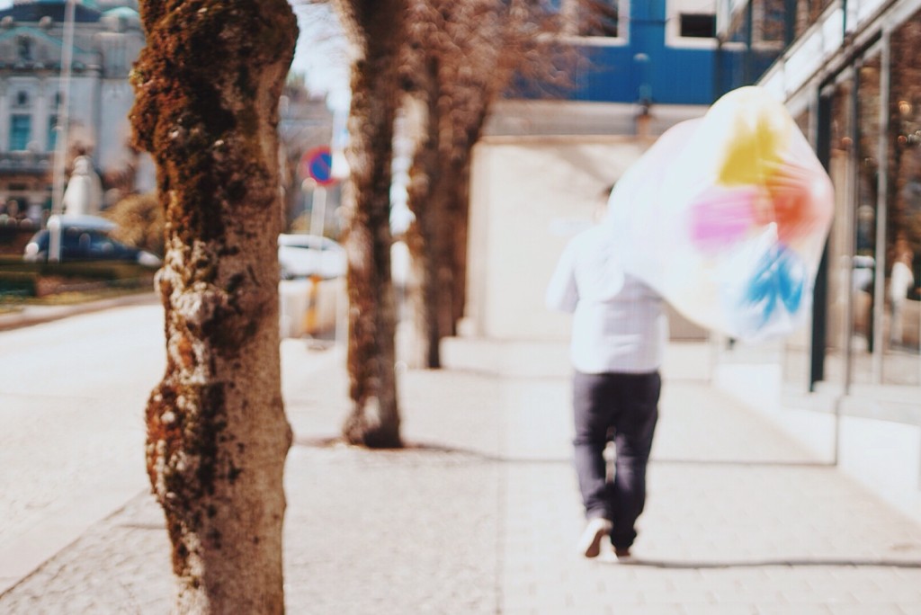
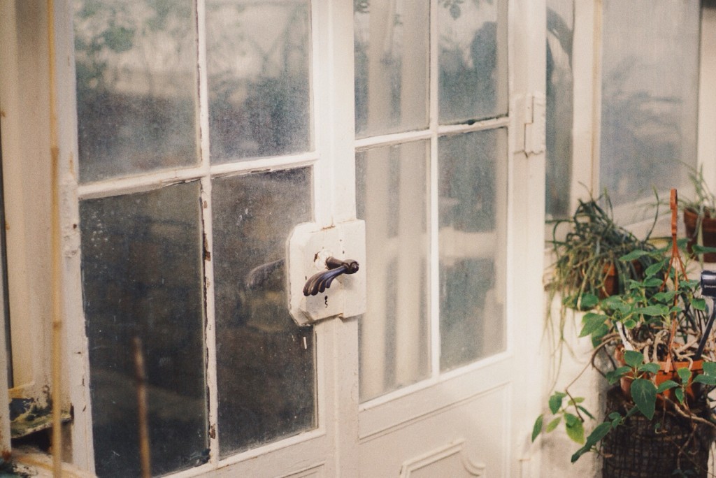
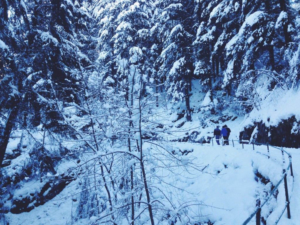
Pieces from this wonderful winter-turning-into-spring we are having. Shot with my A6000 50mm 1.4 and iPhone.
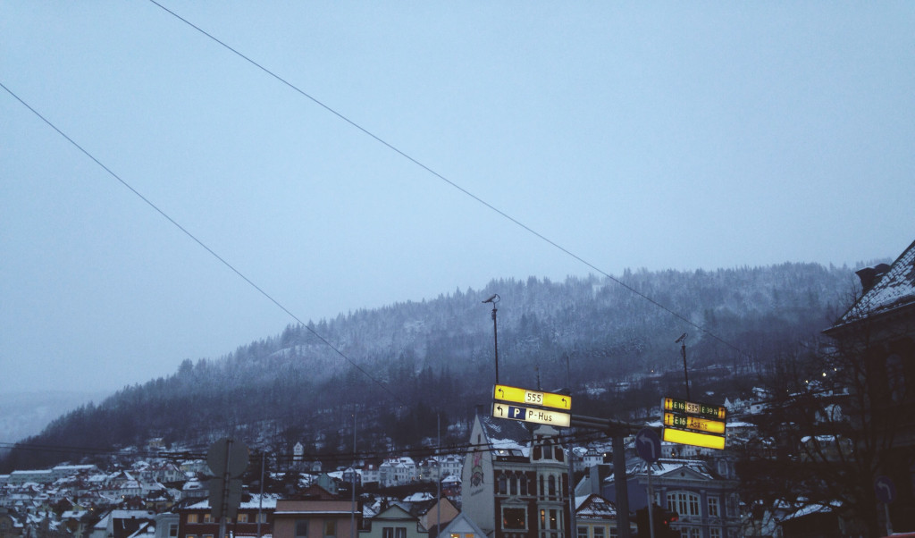
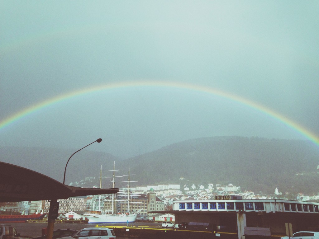
The rainbow creates a strange bevel over the city, you can even see a hint of a double one!
Pieces from this wonderful winter-turning-into-spring we are having. Shot with my A6000 50mm 1.4 and iPhone.


The rainbow creates a strange bevel over the city, you can even see a hint of a double one!
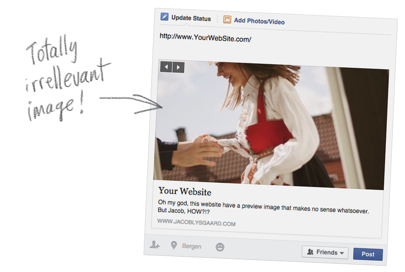 Let me preface this by saying that this is not a tutorial for “how to do stuff on social media”– I’m certainly not that guy. But this is a solution to a common problem, and I haven’t seen it spoken about anywhere else. Which is super, super weird.
Basically, the idea is this: When you punch a website address into a facebook post, it grabs the first few images it finds on that site, and lets you choose one to be shown in the status post. But for many sites, and most blogs I know, those images ends up being pretty useless.
Most times when someone would post a link to my site on facebook, the default image shown would be an image from a non-related blog post, or something from the footer. This means that the people seeing that post don’t get the best presentation of the site being shared. Ugh. Many page admins have started making an image post instead, and putting the link in the description. But that just confuses people, and usually it makes the user click twice to get where you want them.
And remember, the user case we need to worry about is not you, sharing a link to your site from facebook. This is for all the civilians/fans, who shares the link on each others walls and so on, where you can’t control it.
So it needs to happen automatically.
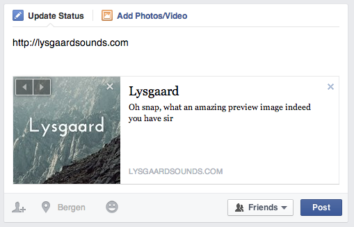
Okay, for talking about the solution, we need go go into nerd mode for a moment:
Ideally, the default image that pops up should be like a thumbnail for your whole site, right? But naturally, you don’t want to put an image high up on your front page, just for facebook to crawl it. So here’s what I did; a simple <img> tag with the thumbnail, but wrapped in a <div> that’s set to display:none, at the top of your <body>. So the image gets parsed by the browser, but doesn’t show up on the page. Plus, because of the display:none stuff, your browser won’t spend any extra time loading the image asset, only facebook will. So no added bloat to your site.
I’m currently using this technique on www.Lysgaardsounds.com, try pasting that URL into a facebook update (you don’t have to click publish), just to see that the thumbnail image pops up in the image box.
Here’s the HTML:
<div id="site-thumber" style="display: none;">

<img src="img/Site-thumber.jpg">

</div>
And lastly, keep in mind I’m a designer, not a developer. But I know some very fine developers that have looked at it, and they say it should work fine indeed.
The very simple HTML you see above works fine for very small and simple sites, bigger systems could find smarter ways to implement this in the back end with some space age PHP, a WordPress plugin or something. But for a single-page site for a musician, that gets shared on facebook now and then, this works brilliantly.
If you tried this technique yourself, show it off in the comments!
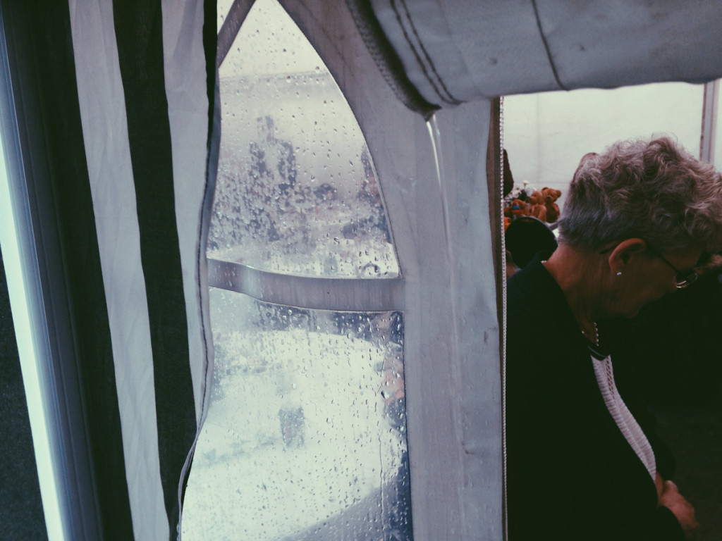
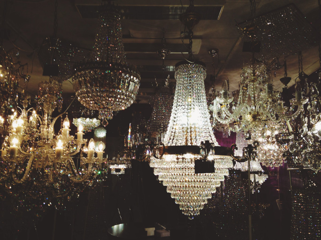
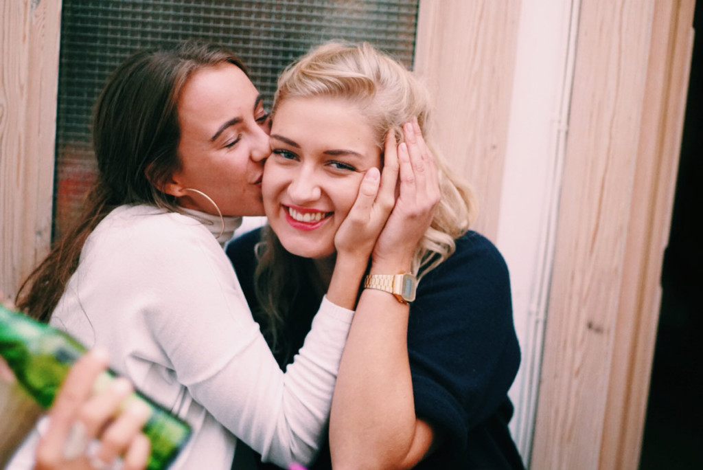
Thought I would collect some of my favourites shots as of late, most of these have also been flying past the feed on Instagram. Some are simple iPhone shots, other come from my wonderful α6000 camera, with this magical 50mm 1.4 lens on. Damn, how I love that camera.
If these tickle your fancy, go follow me on the thing already.



I’m trying (and so far, succeeding) in getting a lot of reading done this summer, since little proper work can be done in this magnificent heat we are having. So I present to you, my reading list for the coming weeks. Here are some classics that should be a prerequisite for membership in adult society (long overdue for me), and some weird and funny books, too.
A considerable part of this stack is based on recommendations and notes by the great Carl Sagan, and deals with things like the nature of consciousness (and in the case of Heaven And Hell, in relation to art history) and the history of civilisation and culture.
The Doors Of Perception & Heaven and Hell I found to be intensely inspirational, not for its descriptions of the effects of chemical hallucinogens on the mind, but for its research on the history of art and society related to chemical imbalances in humans in general. Make an art show, tell people not to eat or sleep for two days before seeing it. People will see some shit.
Aldous Huxley – The Doors of Perception & Heaven And Hell
Aldous Huxley – Brave New World
Herbert J. Muller – The uses of the past–Profiles of former societies
Franz Kafka – The trial (Prosessen)
Terry Pratchett – The science of discworld IV–Judgement day
How about you guys? Got books?
Here is a quick “tool-track” I made for an upcoming gig at Fisk&Vilt in Oslo. It’s a free download, if you want to get it for yourself.
Some days, it’s all about the little things. Actually, that might be most days.

So today, I made this loading icon, a microscopic cog in the machine that will be the new Altibox TV overalt system we are working on. Big things! And small things.