A moving brand: Nabovarsel
Nabovarsel
IDENTITY
Lots of weird sketch processes with this project! Nabovarsel has a pretty complex theoretical and philosophical backbone to everything they do, so translating all this into a unified identity can be, well, daunting. Instead of simply showing you the finished product, let’s instead go through the process from the start, and look at both the good and the bad ideas.
Nabovarsel is a collective of people working within electronic music and art in Bergen, Norway. Record label, music and art collective, Nabovarsel have claimed many titles over the years, but most people know us from our consistently award-winning and butt-moving club night at Landmark, which ended its 6-year stint in 2015.
The first brief centred around the desire to mirror a true side of the city, as well as convey their non-conformity, counter-culture, Do-it-yourself-mentality and electronic music and art values, while at the same time feeling like an institution, something everlasting but always changing, mock-official, punk-bank-like.
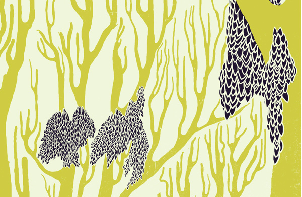
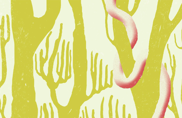
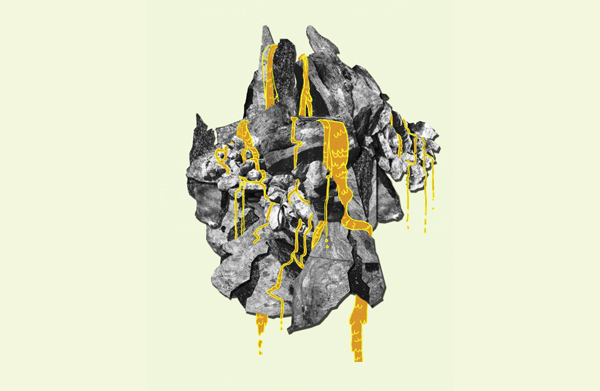
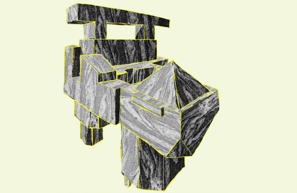
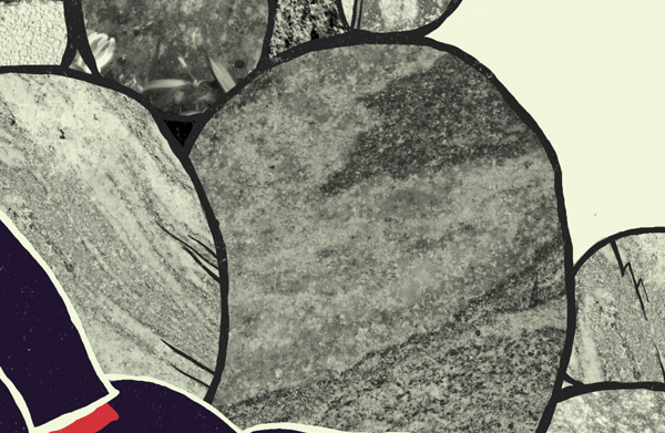
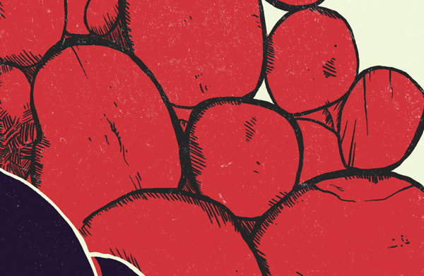
My first sketches ended up in this idea about merging the people, symbolised by the houses, and the city, symbolised by the mountain. Ultimately a dead end though. Let’s have a look:

The houses

The mountains
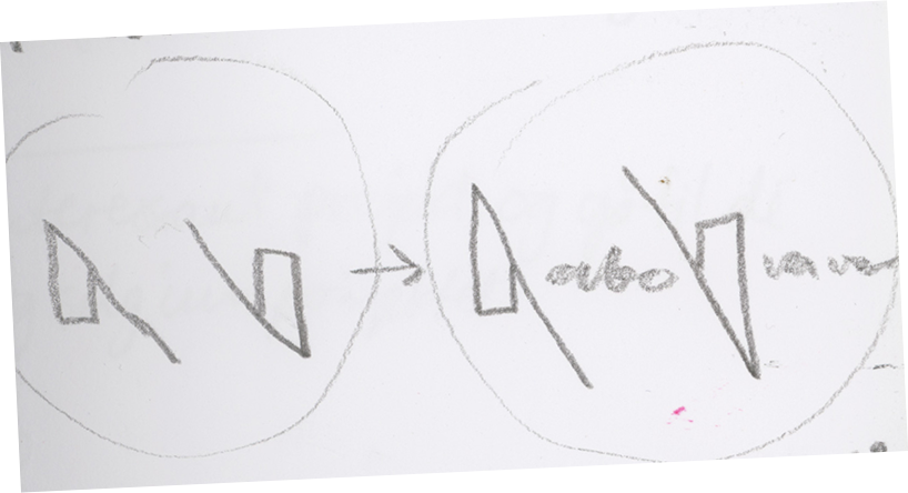
I got this idea for a pretty far out N symbol after workshopping some ideas with Erik “Teipu” Stokkmo. The N can split up, and become both the N and the V for the logotype. Begging to be animated!
Then, in a sketching session with Knut Harald Longva, this concept emerged; bulding the N shape from a disrupted circle. Which works great on a number of conceptual levels.
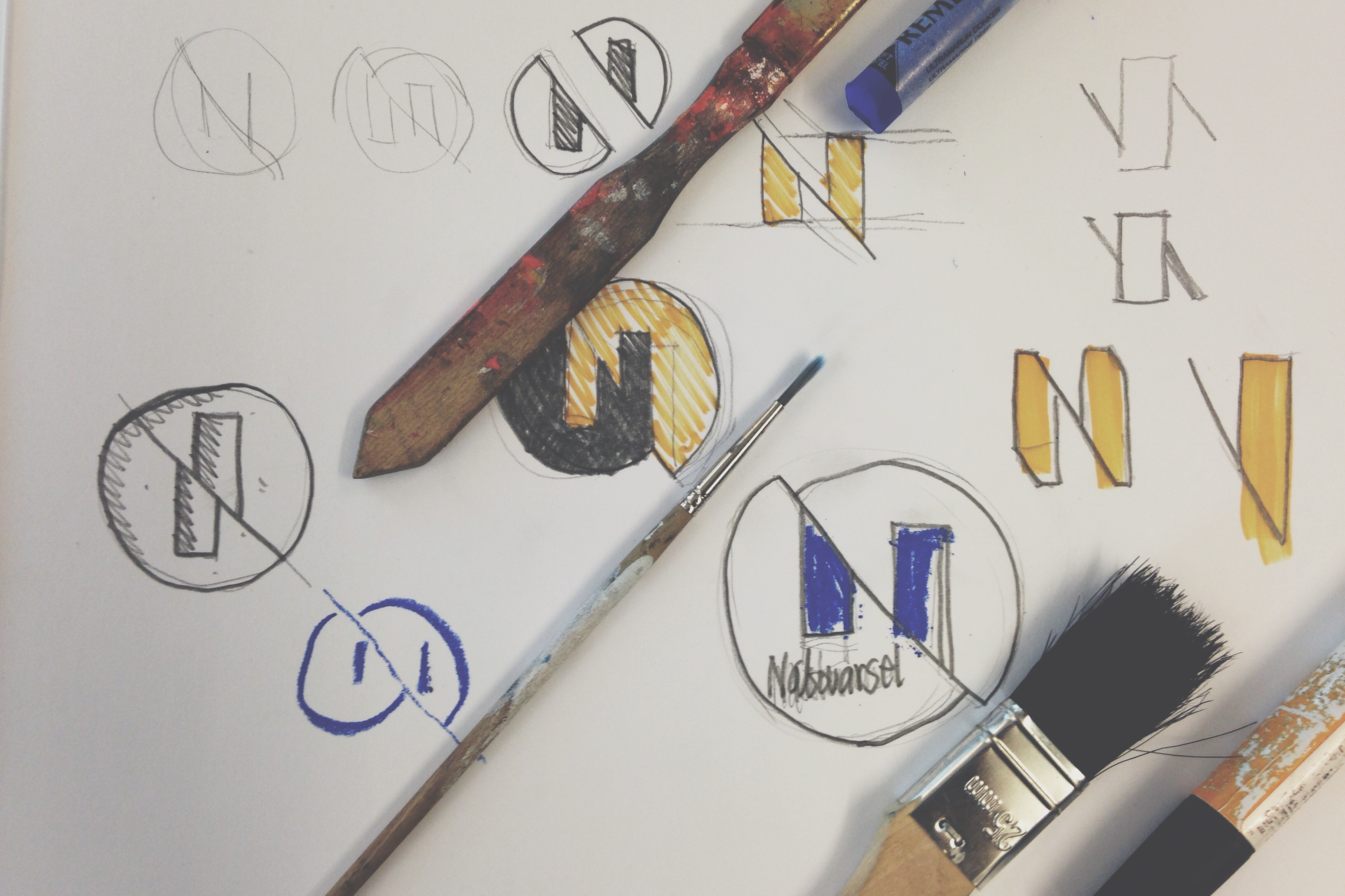
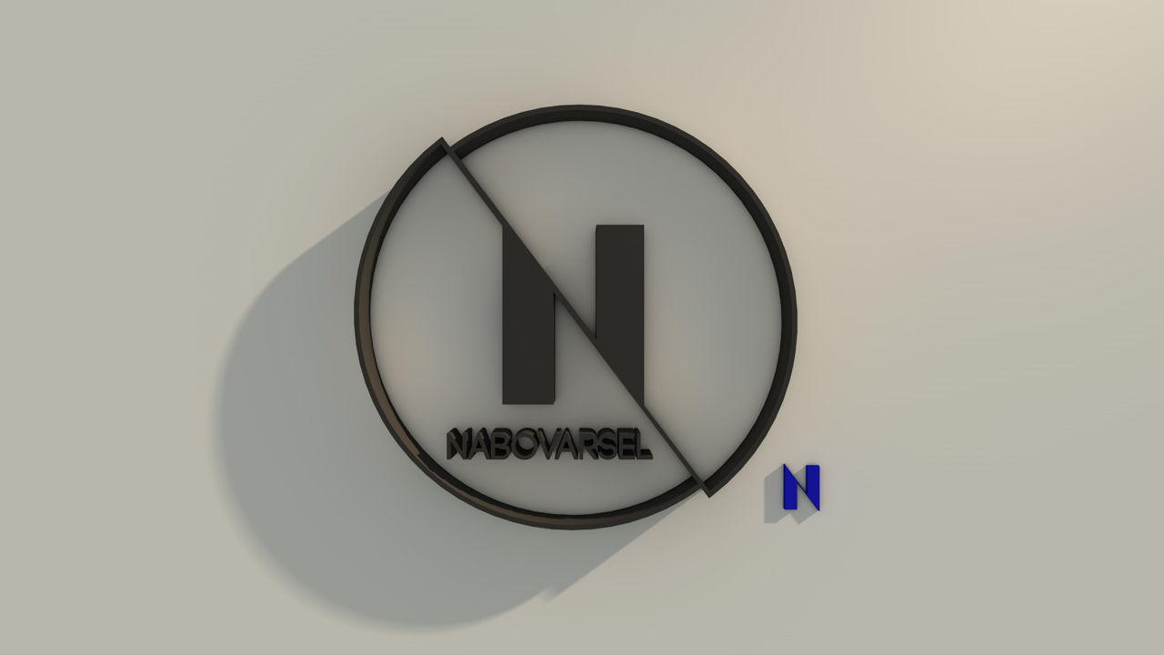
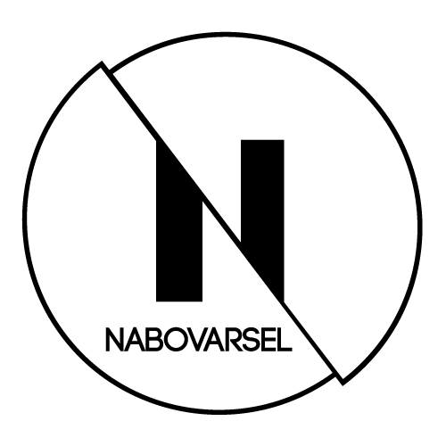
But despite being a lot of fun, in beta testing we quickly found out it had some problems. Including the entire wordmark inside the emblem, as well as the rather thin outer rim made legibility a problem in small sizes. Back to the drawing board:
Iteration
After some preliminary test usage, we concluded with the following changes:- Consolidate the “full circle” version and the simple “N” version into a more unified form, usable in any size and media
- Solidify the form to be more robust, as the hairline of the current version is to frail
- Enable a more unified typography, with clear distinctions and more consistent usage rules

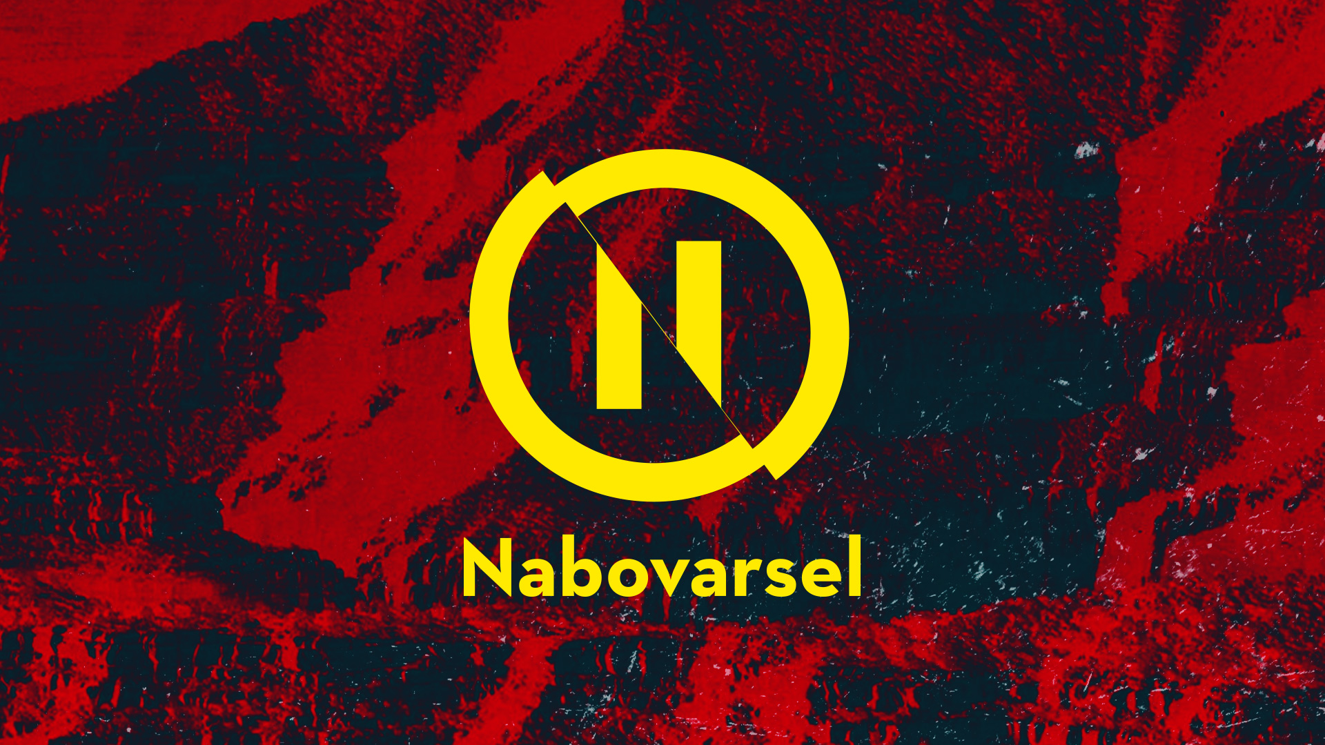
With this version, the N and the circle share the same width, making it sturdy as a rock.
Then on to find a unified typographic style. The first version used Code bold in the logotype and Archer in additional text, neither of which really brought home the bacon.
After a series of type tests and printing, I landed on Neutra as our head typeface, a classy cut that strikes just the right balance between strict and sassy. It also works beautifully in all sizes, in Demi for display heights, and Book for full paragraphs.
Neutra also employs some really nifty ink traps, which come in handy when printing posters.
As you can see, the N and V is also altered to adhere to the 37° cut and unify it with the emblem. (A brand update in 2015 included the use of Space Mono as a main screen-type workhorse).
If you wanna see how the system looks in real life, check out the case study on all the posters I’ve made.
