Norwegian Hull Club

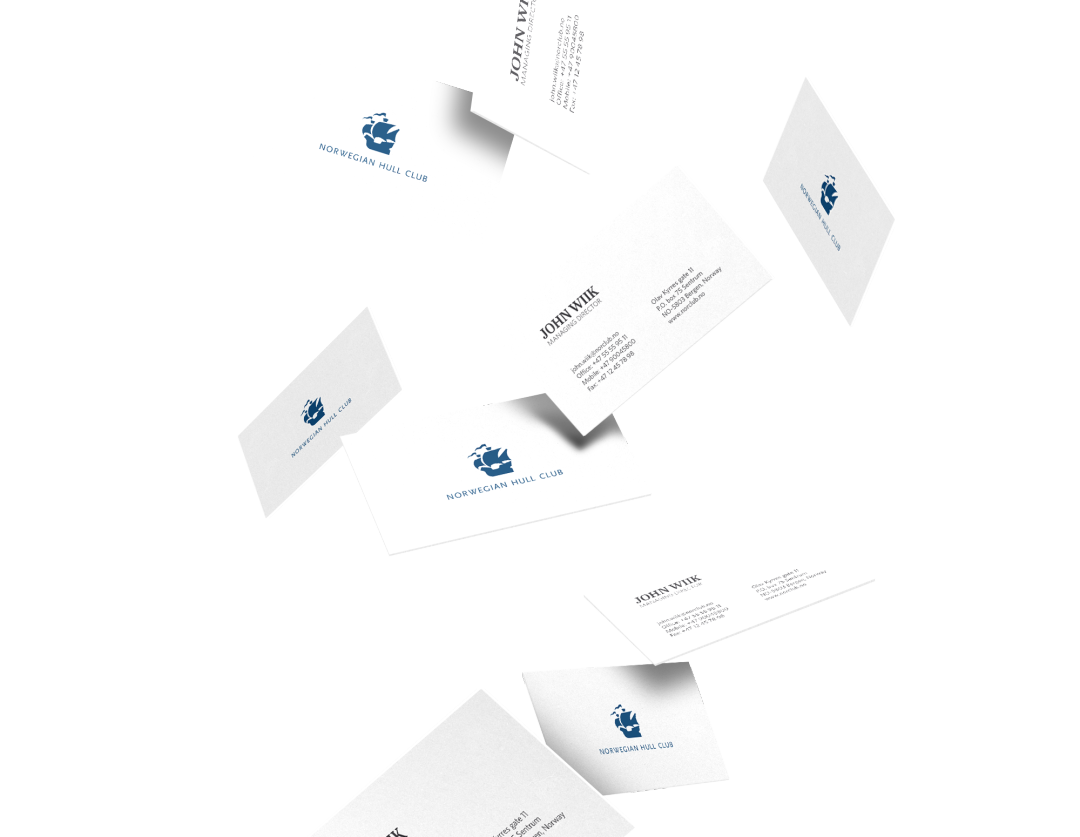
As a part of Sixty, I worked on the brand update for the marine insurance mainstay Norwegian Hull Club.
NHC is a mutual marine insurance company serving Members & Clients worldwide. The Club ranks among the largest pure marine insurers in the world.
Our job at Sixty was to update the company’s visual identity, keeping the class only a hundred years of experience can give you, while utilizing modern web technologies and new movements in design to bring the company up to speed.
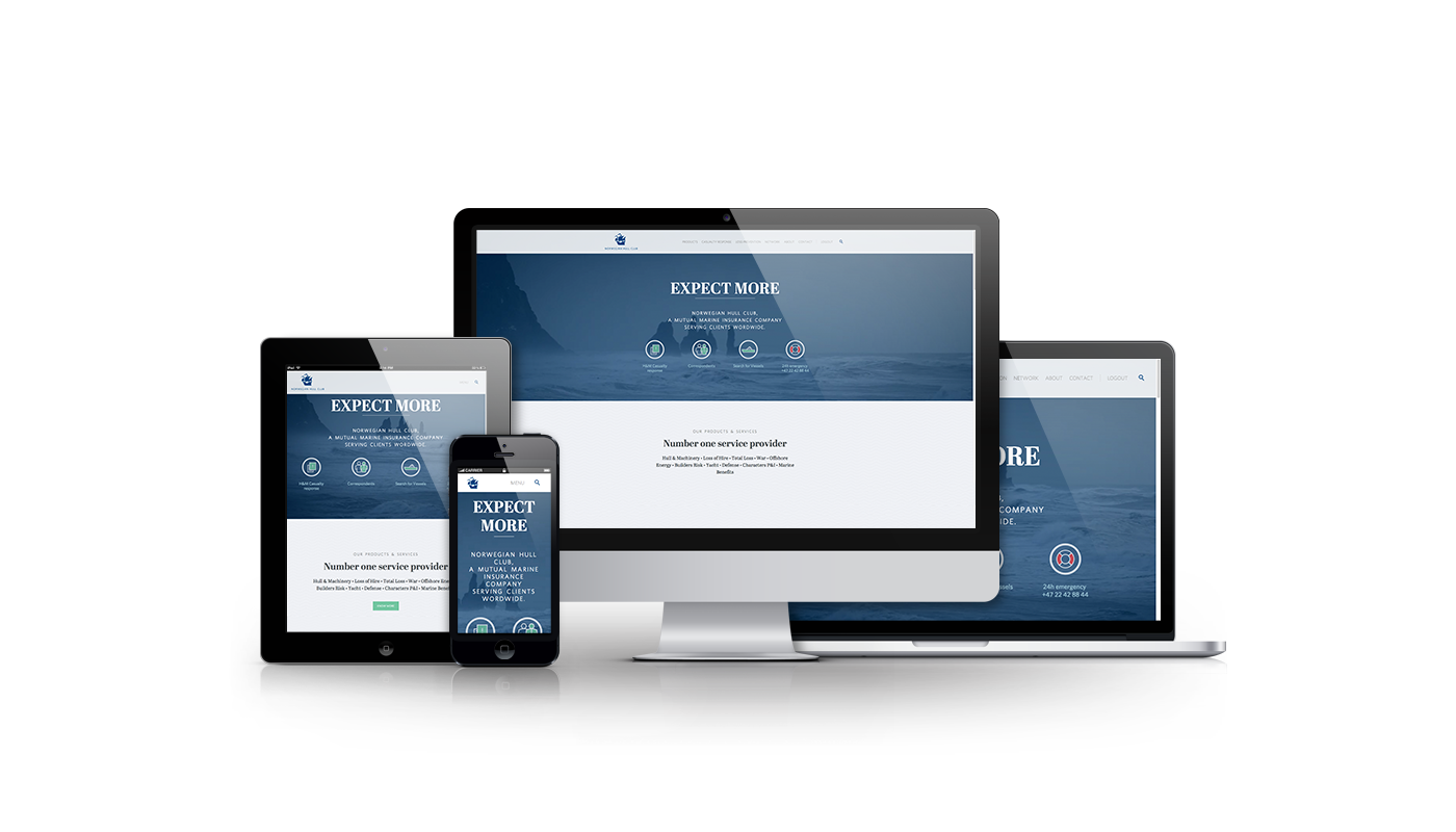
A large part of this was the company’s new website; a project with some very unique challenges. The site needs to be accessible to the huge ships and vessels in the middle of the ocean—usually online via satellite link, and on hardware from.. well, not the newest model. The site also needs to organize a large and ever growing array of information, all of which needs to be readily available to anyone, anywhere. From a prospective client just looking around, to a ship captain scrambling to save her ship from running aground.

See the full website
Logo & Palette update
The old palette was very troublesome to replicate in different colour systems, and the main typography had not aged as gracefully as it had hoped. We developed a new palette that would stay the same no matter where you put it, web, business cards, you name it. The new brand typography uses Whitney and Abril, two complimentary typefaces that will hopefully look as good a hundred years from now as it does today.
Short icon set

Vessels

Correspondents

News

Emergency
Amended color palette

Main blue

Warning / Danger

Action / Attention
Company profile: Sixty
This was a project made as a part of Sixty, a design and development agency specializing in design for the broadcasting industry and creating exceptional user experiences for bringing the web and traditional TV together.
Check out some more awesome case studies at the Sixty Website.
