Space Lab identity

<script src="//cdnjs.cloudflare.com/ajax/libs/p5.js/0.5.11/p5.min.js"></script><!-- [et_pb_line_break_holder] --><script src="//jacoblysgaard.com/wp-content/uploads/2018/04/perlin6.js"></script><!-- [et_pb_line_break_holder] --><div id="processing1" style="<!-- [et_pb_line_break_holder] --> min-height: 400px;<!-- [et_pb_line_break_holder] --> min-width::100px;<!-- [et_pb_line_break_holder] --> z-index:8;<!-- [et_pb_line_break_holder] -->"></div>

Space Lab Identity

Space Lab is part of the University of Bergen.

Our energy system is the major contributor to climate change. At the same time, society is shaped by the way we produce and consume energy. Modern energy sources are rarely visible in our everyday surroundings, yet they enable our form of life and make possible most things we take for granted. Understanding how we are ‘energized’ is crucial to understanding why societies are the way they are, and the possibilities for change. 
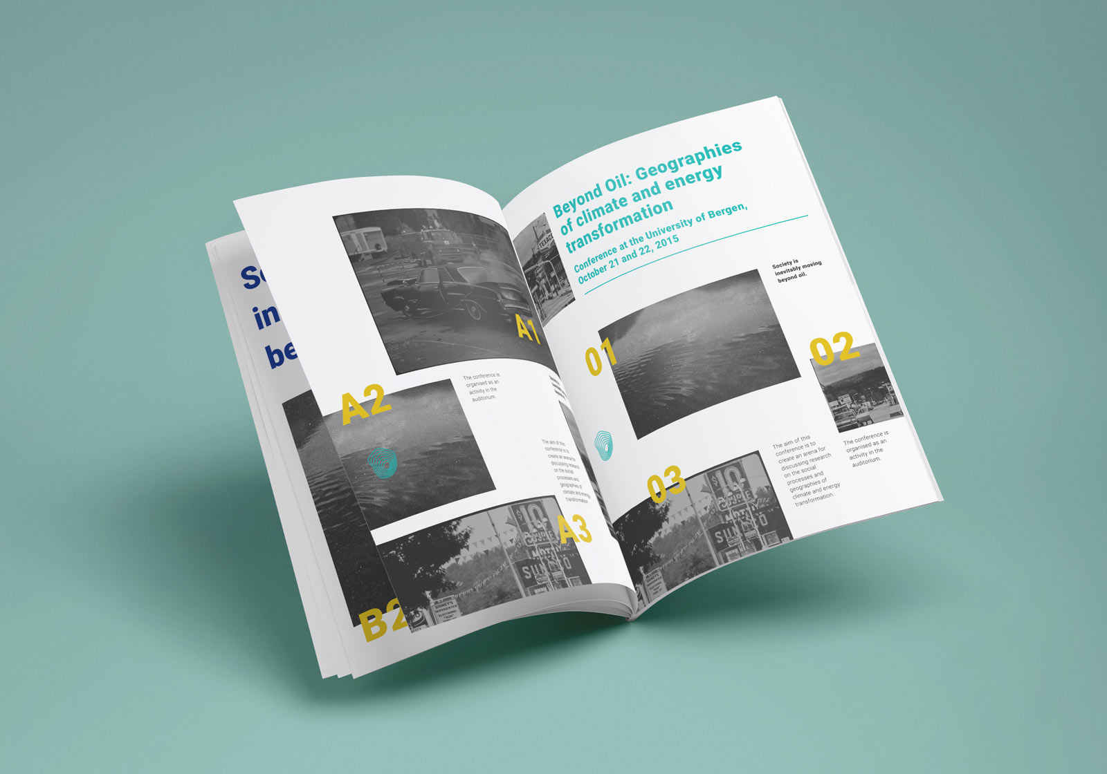
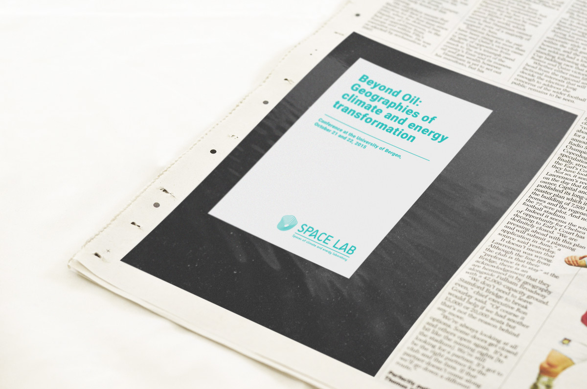
Geography is essential to understand the interconnected challenges of energy and climate change. The Spaces of climate and energy laboratory (SPACELAB) connects research on the geographies of energy, climate and society. The aim of the lab is to generate an engaging academic and intellectual environment to stimulate high quality research on these issues. It is based at the Department of Geography, University of Bergen.
kunemblemLiten The Spaces of climate and energy laboratory (SPACELAB) connects research on the geographies of energy, climate and society.

Inspiration

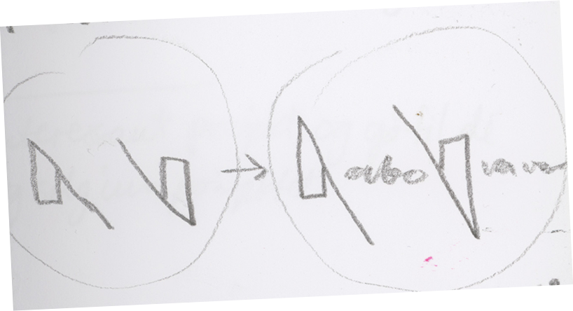
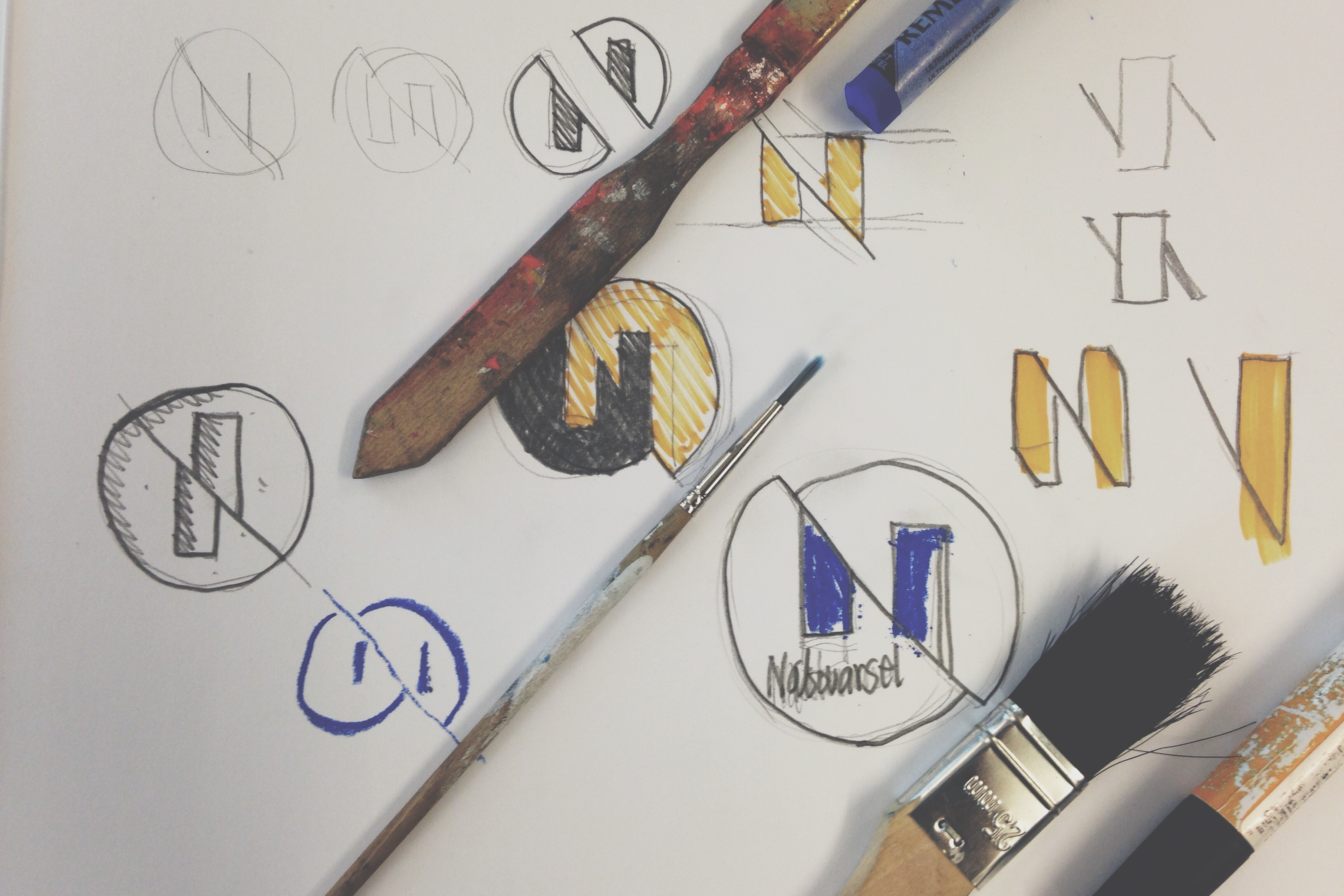
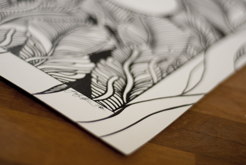
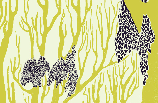
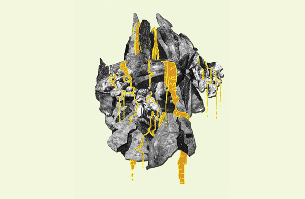
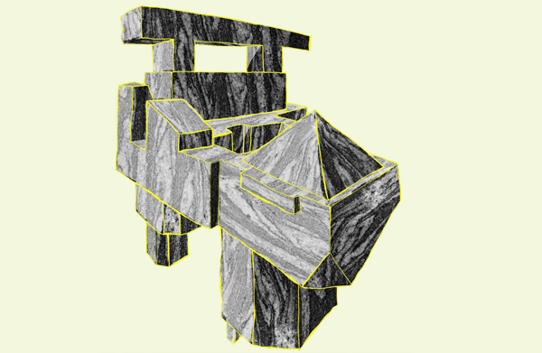
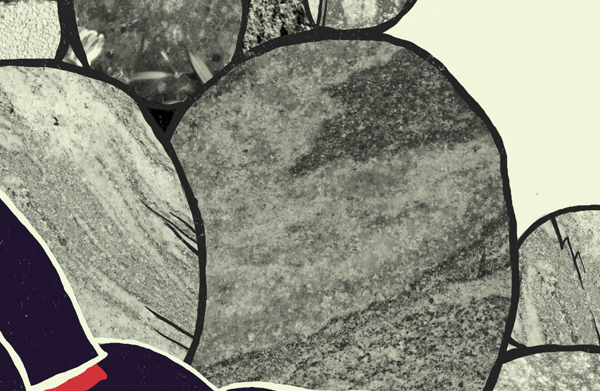
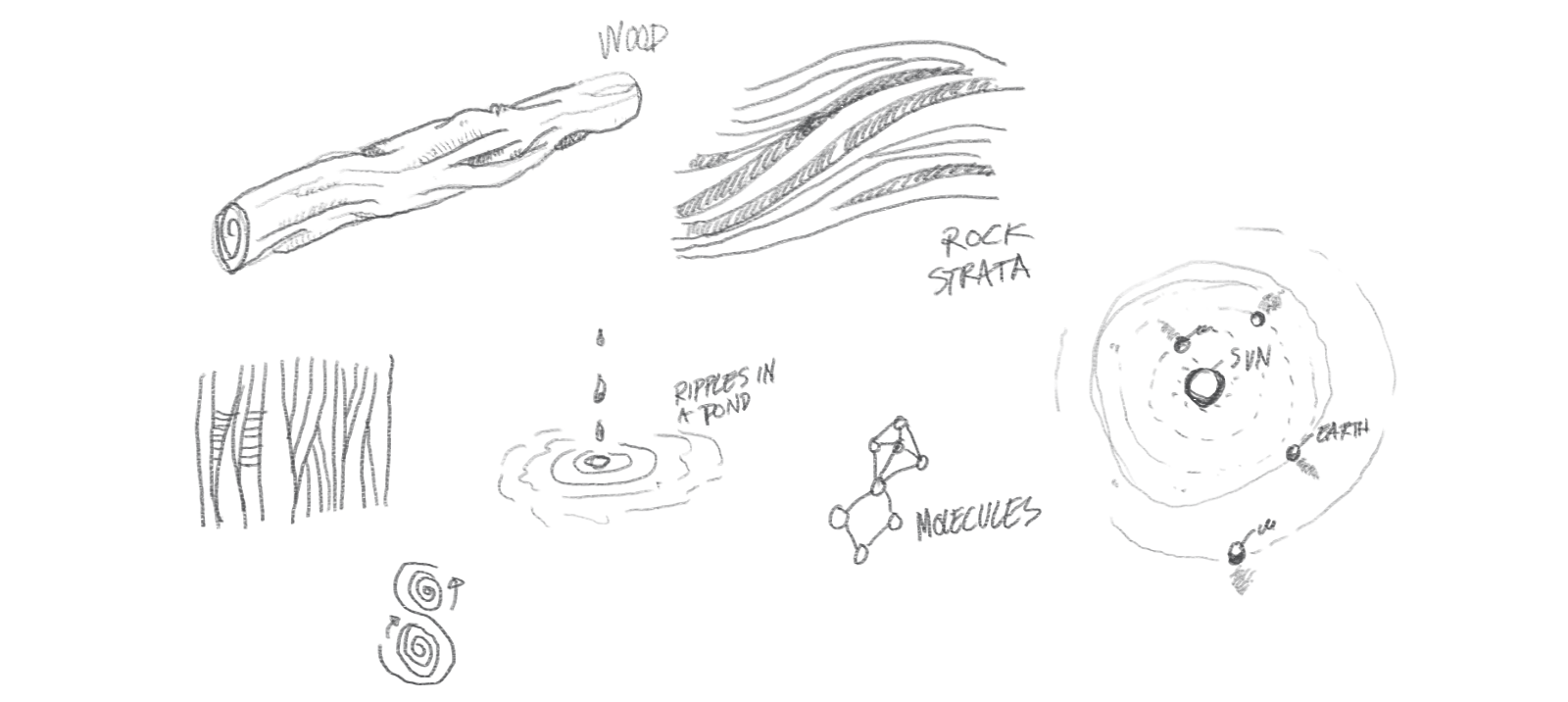
Our inspiration process circled around processes and phenomenon from nature versus its man-made counterparts; in what shapes does the technology of man and mother nature meet? Rock strata, aerodynamics textbooks, interstellar orbit patterns and subatomic particle movements fills the sketchbook.
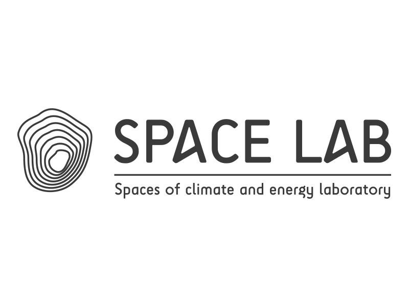
kunemblemLiten Emblem

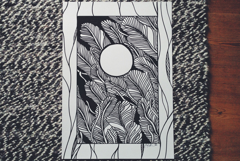
Space Lab’s emblem depicts an abstraction of topography, layers, orbits, radiation and waves. A perfect symbol of the intersection between the natural and the synthetic.
Main emblem

kunemblemLiten Logotype

Space Lab’s main logotype is set in a modified version of SciFly Sans, a friendly but geometrically based sans made by Tomi Haaparanta of the Suomi Type Foundry.
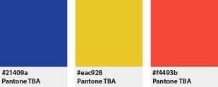
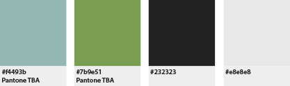
kunemblemLiten Colors

Space Lab’s main color is a bright turquoise, to balance concepts of earth and science. Together with the dark and light grey, these are the colors of highest priority. The second level compliments it to fill in key areas in the color wheel, whereas the tertiary level serves to calm further use down (and avoid things looking like a carnival).
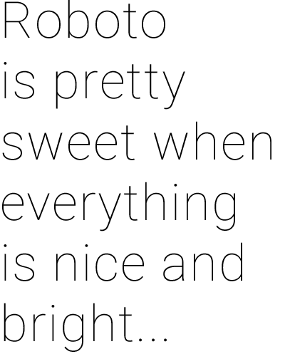
kunemblemLiten Typography

Space Lab uses Roboto as its main typeface in all written material. Roboto is a modern sans serif, developed and famously used by Google, and straddles technology and humanism. It can be used boldly from the thin hairline weight to the massive black, but any lengthy texts should stick to either the light or the regular weight.

Thanks for watching!

Norwegian Hull Club

Norwegian Hull Club

How do you take an insurance giant from print to digital and modernize the presentation while keeping the hundred years of tradition and expertise in check?
As a part of Sixty, I worked on the brand update for the marine insurance mainstay Norwegian Hull Club. NHC is a mutual marine insurance company serving Members & Clients worldwide. The Club ranks among the largest pure marine insurers in the world. Our job at Sixty was to update the company’s visual identity, keeping the class only a hundred years of experience can give you, while utilizing modern web technologies and new movements in design to bring the company up to speed. A large part of this was the company’s new website; a project with some very unique challenges. The site needs to be accessible to the huge ships and vessels in the middle of the ocean—usually online via satellite link, and on hardware from.. well, not the newest model. The site also needs to organize a large and ever growing array of information, all of which needs to be readily available to anyone, anywhere. From a prospective client just looking around, to a ship captain scrambling to save her ship from running aground.

See the full website

Logo & Palette update

The old palette was very troublesome to replicate in different colour systems, and the main typography had not aged as gracefully as it had hoped. We developed a new palette that would stay the same no matter where you put it, web, business cards, you name it. The new brand typography uses Whitney and Abril, two complimentary typefaces that will hopefully look as good a hundred years from now as it does today.
logo

Short icon set

Vessels

Correspondents

News

Emergency

Amended color palette

Main blue

Warning / Danger

Action / Attention

Company profile: Sixty

This was a project made as a part of Sixty, a design and development agency specializing in design for the broadcasting industry and creating exceptional user experiences for bringing the web and traditional TV together. Check out some more awesome case studies at the Sixty Website.

A moving brand: Nabovarsel

Nabovarsel
IDENTITY
Lots of weird sketch processes with this project! Nabovarsel has a pretty complex theoretical and philosophical backbone to everything they do, so translating all this into a unified identity can be, well, daunting. Instead of simply showing you the finished product, let’s instead go through the process from the start, and look at both the good and the bad ideas. Nabovarsel is a collective of people working within electronic music and art in Bergen, Norway. Record label, music and art collective, Nabovarsel have claimed many titles over the years, but most people know us from our consistently award-winning and butt-moving club night at Landmark, which ended its 6-year stint in 2015. The first brief centred around the desire to mirror a true side of the city, as well as convey their non-conformity, counter-culture, Do-it-yourself-mentality and electronic music and art values, while at the same time feeling like an institution, something everlasting but always changing, mock-official, punk-bank-like. My first sketches ended up in this idea about merging the people, symbolised by the houses, and the city, symbolised by the mountain. Ultimately a dead end though. Let’s have a look:
The houses
The mountains
I got this idea for a pretty far out N symbol after workshopping some ideas with Erik “Teipu” Stokkmo. The N can split up, and become both the N and the V for the logotype. Begging to be animated!
Then, in a sketching session with Knut Harald Longva, this concept emerged; bulding the N shape from a disrupted circle. Which works great on a number of conceptual levels.
But despite being a lot of fun, in beta testing we quickly found out it had some problems. Including the entire wordmark inside the emblem, as well as the rather thin outer rim made legibility a problem in small sizes. Back to the drawing board:

Iteration

After some preliminary test usage, we concluded with the following changes:  
  • Consolidate the “full circle” version and the simple “N” version into a more unified form, usable in any size and media
  • Solidify the form to be more robust, as the hairline of the current version is to frail
  • Enable a more unified typography, with clear distinctions and more consistent usage rules
With this version, the N and the circle share the same width, making it sturdy as a rock. Then on to find a unified typographic style. The first version used Code bold in the logotype and Archer in additional text, neither of which really brought home the bacon. After a series of type tests and printing, I landed on Neutra as our head typeface, a classy cut that strikes just the right balance between strict and sassy. It also works beautifully in all sizes, in Demi for display heights, and Book for full paragraphs. Neutra also employs some really nifty ink traps, which come in handy when printing posters. As you can see, the N and V is also altered to adhere to the 37° cut and unify it with the emblem. (A brand update in 2015 included the use of Space Mono as a main screen-type workhorse). If you wanna see how the system looks in real life, check out the case study on all the posters I’ve made.

Thanks for watching!

Phono festival identity

The Phono festival is one of the largest festivals in western Norway, held every year in the fall. In previous years they used to change the entire identity annually, but after my version, they decided to make my base identity permanent, and invite artists to create new posters and graphic styles for each year. This project also received gold at the Visuelt design awards.
One of my starting points was that I wished to mix together two looks – a very old school, opera ticket style, with a modern, intricate, super detailed design aesthetic. I quickly found Forum, a great typeface by Denis Masharov to solidify one end of that spectrum. With Forum as the main typeface, it’s important for the logotype and other stuff to go nuts in the opposite direction.
Then it came time to do the teaser poster, to be released months ahead of the festival itself. I started making a series of technique studies, to really nail the style I was going for. You can actually buy the originals, if you want.
Posters; the promo poster released 6 months before the festival, and the main poster showcasing the acts. These are available in the shop!
Spread from the festival programme
A part of the merchandising: Tote bags, with elements continued from the poster.
You guessed it; website.

Thanks for watching!

[et_bloom_inline optin_id="optin_4"]