Jan 23, 2012

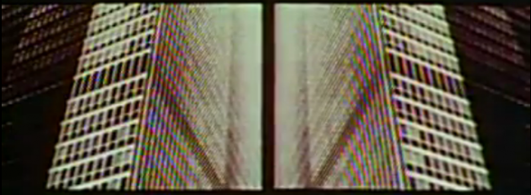
I just found this half-hour pitch on the now legendary identity system for Bell by Saul Bass.
For logo-nerds such as myself this is top entertainment, and my fascination for the graphic design work of this era helps too.
It’s quite fun to watch how far the design field has come since those days, and at the same time, which things stay as true today as they did then.
From hilarious design statements:
“In the contemporary world, stripes have a message. “
To this simple sign of the times, about the new uniforms for the female employees:
“More flattering than anything offered by the airlines.”
Enjoy.
Jan 15, 2012
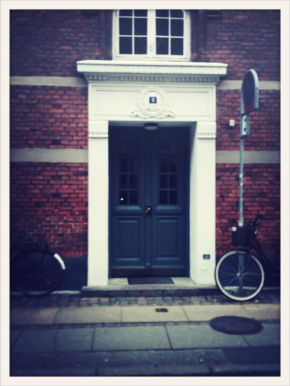
So, we just signed the contract on a beautiful new apartment, in the Fredriksberg area of Copenhagen.
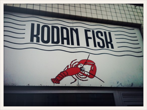
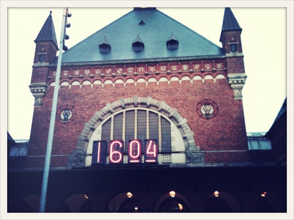
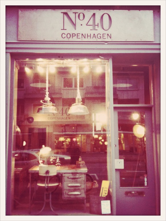
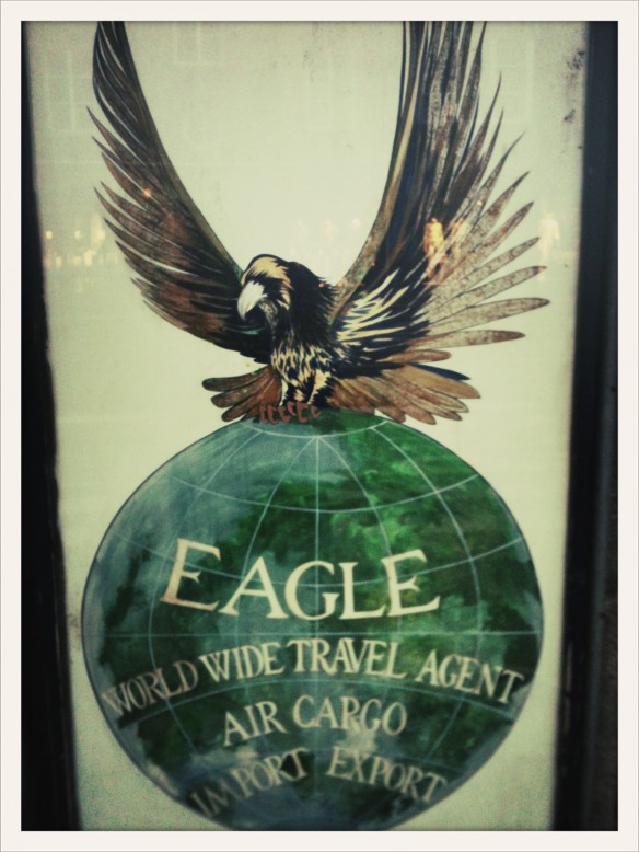
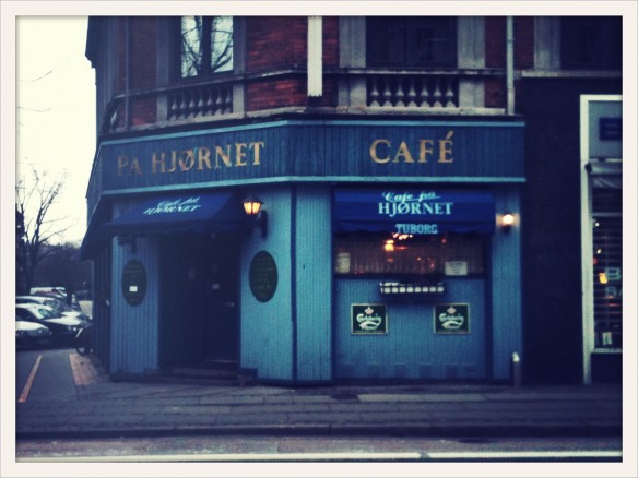
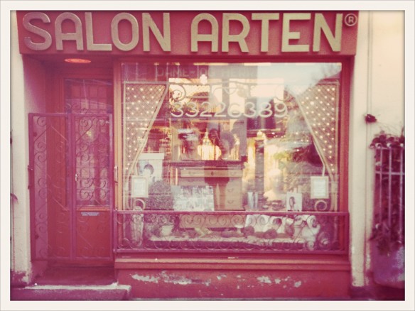
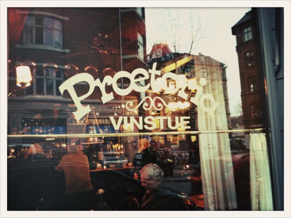
We haven’t moved yet, so I’m spending some time in the general area with a camera to get to know my new surroundings. Here is a collection of some pretty storefront signs, cute neighborhood bars, and our new front door!
And yeah, I used one of those stupid photo apps. Sue me.
In other news, I’m turning up the dials on my poster and silk screening production. Getting all the stars aligned for it is talking a little time, but stay tuned for some new stuff showing up in the store before long!


Dec 6, 2011
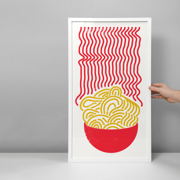
While working on the new poster for Nabovarsel (which I will be able to show you soon), this form came to me. Too bad I already have an established visual style, I really liked the inherent symbolism and feel of this one. Thoughts?


Dec 6, 2011
I love the new look that Google just rolled out for Gmail and its related services.
But it made me think of one little improvement; something that could reduce my inbox count to its happiest state of zero in no time (and yours, too).
When arriving at work to sort through all the new mails, I have to either click into each one separately and delete/archive/label them, or in the inbox, select the ones I want to archive, then click archive, than go through the list again if something needs to be deleted, and so on.

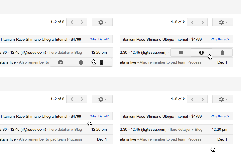
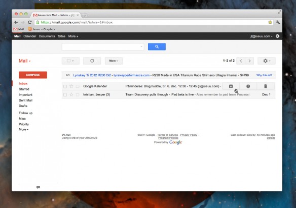
So this is my idea. When hovering over a new mail in the inbox, delete/archive/spam (maybe even label) buttons pop up, and you can go through your whole inbox like a magic wand, email receipts and stuff nicely stacked going towards the archive, boring newsletters hurled in the trash.
I even made you a little mock-up of what it might look like, to give you an idea.
What do you think?


Nov 10, 2011

I’ve had a lot on my plate these few days, so it’s been a little quiet on the blog. But fear not, my return will be swift!
In the meantime, here’s a friend of mine remixing another friend, to amazing results. I give you; Skatebaard‘s remix of Njaal‘s Me and Hugh, out now!
Image credit: Feltron
Oct 14, 2011
 Did you just upgrade to iOS5 on your iPhone/iPad/whatever? Yeah, me too. One small feature they added without anyone noticing, it the ability to use your own ringtones for various alerts, not just the main ringtone when someone calls. So, naturally, I went completely overboard and made you a musical theme, a whole suite of sounds way better than the boring default ones.
The theme is called “Humans”, as it’s basically made from robots telling you what is going on with your phone. So instead of trying to remember that the “bzzoing” sound means “new tweet”, your phone will just tell you; “new tweet”, in a robot voice.
And if you’re thinking about getting a new phone with the fancy new virtual intelligence Siri, this is the perfect robot companion.
The main ringtone is a bit more fancy of course, a Nintendo inspired composition to psyche you out while you scramble between the sofa cushions for your phone.
(more…)
