Best. Logo revision. Ever.
 I just found this awesomeness made by Miguel Palmeiro. What a great simplification! An incredible shame that it’s only a proposition, and not an actual remake(yet, at least).
University of Coimbra, get on that!
 I just found this awesomeness made by Miguel Palmeiro. What a great simplification! An incredible shame that it’s only a proposition, and not an actual remake(yet, at least).
University of Coimbra, get on that!
A few days ago my colleague and internet grand master Mario Urban showed me something.. interesting.
trendlist.org is an aggregation, analyzation and exposition of modern design trends. It might be a secret weapon for you. But be careful! This is to design what The Game is to dating; if you follow it blindly you’ll end up treating people like machines and lose all love of the craft. But as a tool in your arsenal it can help to make things clearer, and show you what to avoid just as much as what to do. it’s also a helpful way to categorize and help you see your own bullshit from time to time.
Anyone can put a triangle in space and make the text underlined. Real designers ask themselves what the content needs, not how they can squeeze the content into a predefined style.
Just remember: With great power comes great responsibility.
Like any other sane person I think Instagram & Vine are all sorts of fun. If you are on there yourself, let’s follow each other already!

JacobLysgaard on Instagram
Search for JacobLysgaard on Vine!
Here are some highlights:
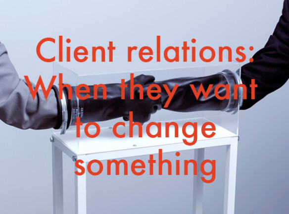
As a designer, making your clients happy is paramount. But a client relationship is still a relationship, and things might get sticky. These are some thoughts on how to avoid potential stickiness.

Image courtesy of Dimitri Markis
So you’ve been toiling over this project night and day, and finally sent the first finished version off to your client. And the response is that yes–they like it a lot… BUT. How about handwriting instead of a strict typeface? My dog likes it better in blue. How much is reasonable, and how do you respond?
I just wanted to share and write a few words on the new iteration of the Nivea brand, done by San Fransisco-based Fuseproject. It builds from the brand’s original product from 1925, the iconic blue Nivea Créme tin. I don’t know about you, but that blue tin was a staple in our bathroom throughout my childhood.
In a world where more and more brands try to look like detergent, Nivea have dared to unify and boil down their packaging to this. And for that, they should be applauded. The lids of the packaging is a really nice touch, letting the top be angled towards the end user on the shelf. Now let’s have a look.
A video with Yves Béhar talking about the new style after the break! (more…)
For this reason, the lack of such on iOS devices have perplexed me for as long as I’ve used these devices.
I’ve done several concept sketches and UI mock-ups of “finder for iOS”, without landing on something good enough to put out there.
But yesterday, as I read Oliver Lichtenstein’s thoughts and saw apple’s new OS, it dawned on me. Apple was way ahead of us in that they want to shift the entire paradigm of file handling on computers right under our noses.
In case you haven’t seen it, Apple’s new OSX basically wants us to use folder structures no more than one level deep. Say what? Yeah, really.
But as you understand how it will be used, it actually makes a lot of sense, at least for the not-too-nerdy part of the user base.
Basically, the human brain sucks at managing complex folder-in-folder structures to begin with, but somehow we’ve been stuck like this since forever. Apple’s hope is that in ten years, we’ll look at these folder-in-folder structures we have today like we now look at command-line computer use from before the graphical user interface was born.
Only time will tell if this new way of thinking about information management really sticks. But I bet you and I both get a special look on our faces when we say “I should really sort out all those folders today”.