Mar 6, 2014

I will not apologise for the lack of posts lately, but I can explain its reason: I’m building a brand new site, which will focus more on the stuff you’ll want to see, rather than focussing on me and my intermittent absence. It will be great. no, you can’t see it just yet. But soon.
In the meantime, I have something cool for you to check out:
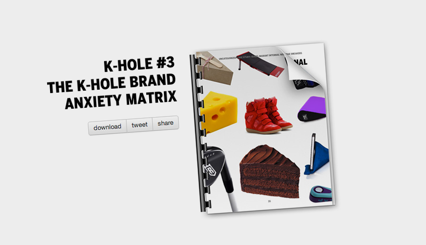
Trend analysis and design academics is a big theme of mine, and the people at K-hole seem to share it. They put out reports as free PDF-s talking about the cultural shifts we experience as people and lots of wild themes you’ll find very interesting if you make things, read things, or breathe air.
Go read!
Oct 28, 2013

Here’s a thought.
Art is supposed to be, by some definitions, incomprehensible. Shattering, obscure, never-ending.
Design, on the other hand, is structure and organisation of content, getting the message across, explanations and obviousness. in short, the opposite. How can you make something which is both?
Both art and design takes many forms, and a lot of the time the two terms does not intermingle at all (that I can think of). Take interface design and abstract sculpture, for example. Let me see you mix those two up. Okay, so we both just did, in our heads. But you know what I mean.
Let us then think of something more familiar, like an event poster. In this realm, art and design acts more like two opposite points on an axis, two different colors of clay that can be mixed.
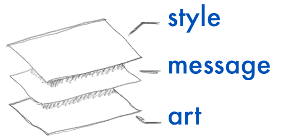
Let’s look at what happens when an observer views a piece, in the order they see the content:

So in order of what the observer sees (or, if you will, comprehends), it goes like this: First is the style, that is, the cultural references, the eye-catcher, is it “my kind of cool”, does it feel like it belongs to me. Then comes the information, the practical necessities and the core of the message you are trying to get across. Some times the “core” message is embedded in the other layers, and this is the most mis-used layers, as many people think it is the only one. Lastly, but in a multitude, lies the art. This can be one layer, or many, or none. The longer the piece is viewed, and the more the viewer comprehends, the deeper one sees. But since the deeper layers are covered by the ones above, it quickly gets murky and dark, leaving viewers confused and interpretations flailing.
This may seem strictly academic, and this may simply be the coffee talking, but keeping this order, as well as how to mediate the contradictions in mind, can do great things for how you work. The most important part is knowing that these “layers” exist, and identifying them in your own work.
If one or more layers are missing, you have a problem no matter what you are making. What do you think?
Sep 26, 2013
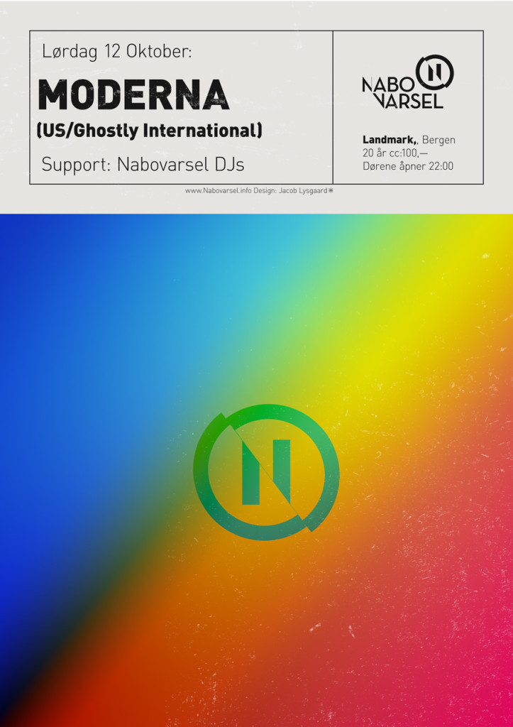
Time for a party! This time we are bringing back the lovely Moderna. Together with Sam Valenti they basically make Ghostly international, one of the planet’s coolest labels, happen.
If you are one of the locals, I look forward to seeing you there!
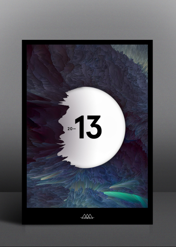
The night’s poster was made in a frenzy thinking about squinting at the sun. Squint squint.

Sep 16, 2013
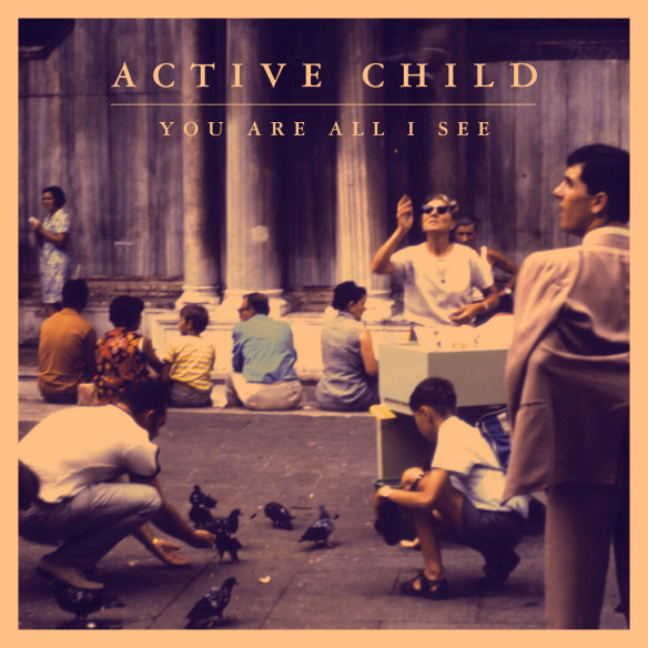
 Just a quick post here to show you something awesome – I just discovered Active Child, the new number one on my playlists. Call it post-RnB if you will. Manages to remind me a bit about Nils Bech, too.
Check the guy out on Spotify and Soundcloud! (more…)
Sep 5, 2013

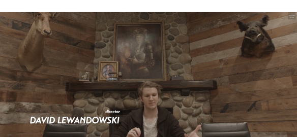
Check out this mini-doc about creativity and making money at the same time – from the good people over at Eskimo.
See the video after the jump! (more…)
Aug 15, 2013
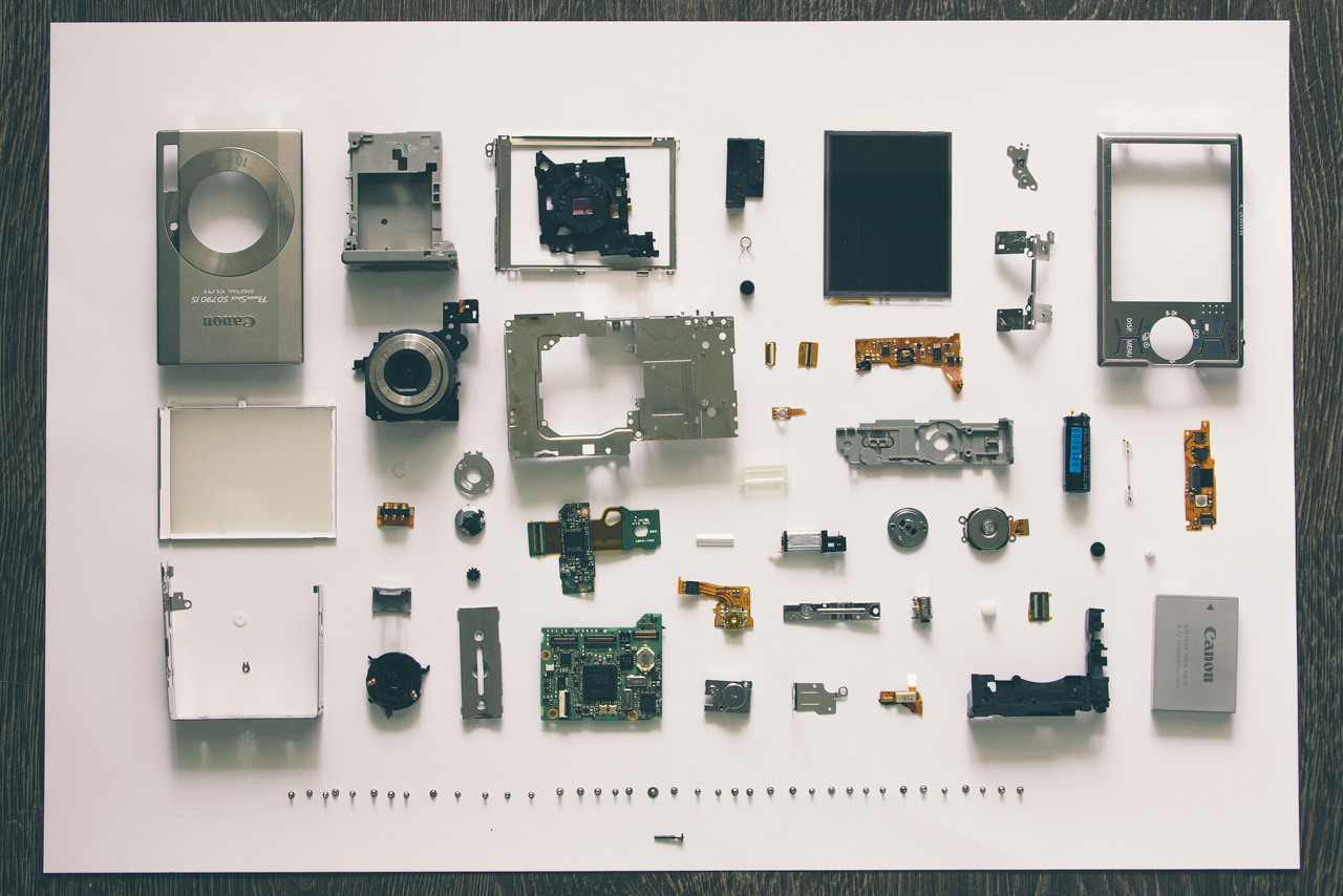
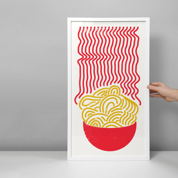
I just wanted to hip you to this incredible print from Tobias Von Schneider I just found. It blew my mind, at least.
We are working on some branding for an insurance giant these days, a really fun and inspiring project, actually. Looking forward to playing alongside Arca in a week, and some other, smaller projects that you’ll hopefully see the results of soon-ish. Be good in the meantime.
