article in the RAFF addition of Bergens Tidende
Me and Kiki were interviewed as “up and coming” designers, for this Raff magazine that came with BT yesterday. It’s all in Norwegian, though.
See it big and read it at Flickr!
Me and Kiki were interviewed as “up and coming” designers, for this Raff magazine that came with BT yesterday. It’s all in Norwegian, though.
See it big and read it at Flickr!
I just finished a new poster for a Nabovarsel event. I started out with the image of the glacier, and decided to be inspired by this Jay-Z cover:
And so this is what came out:
Okay, so the Jay-Z reference might not be too obvious. But it’s what started me thinking. What do you guys think?
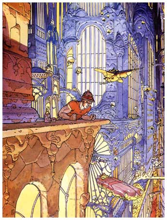
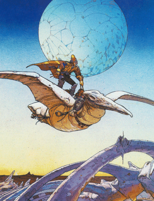
When I was a kid, my father had these comics that I read all the time. The crown jewel in his collection were Moebius’ Inkal series, which chronicles the adventures of sci-fi private investigator John Difool. Ever since this first meet with Moebius, I have kept an eye on his work, and tracked down everything I could find of the old stuff he did.
He is perhaps most known for his creation of the western comic Blueberry. He started this comic in Pilote, and went gradually over to doing science fiction when he started Metal Hurlant, a french science fiction comic (later incarnated into Heavy metal in the english-speaking world)
One especially noteworthy story is that he was deeply involved in the film adaptation of Dune, together with Alejandro Jodorowsky and Salvador Dalí, among others. The entire project was killed due to distribution issues, but then the gang said “crap. Now what?”. So they made Alien instead, just like that.
Now that we’ve seen Avatar, Star trek and so on, it’s only a question of time before someone picks up the pieces and makes the Dune film, for real this time.
Another film project with Giraud that was actually finished? The fifth element, that’s what. Oh, and Tron, nothing less.
[singlepic id=142 float=left]
The eminent blog Sci-fi-o-rama has collected some of Girauds work for Dune, it’s all amazing.
It is now impossible for me to read any of his comics for more than a couple minutes straight, before I have to make a run for my sketchbook.His complete mastery of form achieved by simple line work is incredibly satisfying and inspiring. I have a pocketbook copy of Arzach, which now is quite a bit heavier than when I bought it, thanks to all the notes and paper clips I put in there.
As an interesting side note, Giraud is a good friend of Hayao Miyazaki, the heart of Studio Ghibli. Apparently, Giraud named his daughter Nausicaä, after the lead character from Miyazaki’s film Nausicaä of the Valley of the Wind. Which just happens to be on my top three most awesome films ever list.
his official homepage is in french, so you’re better off at wikipedia. Here is a really nice documentary about his history as an artist.
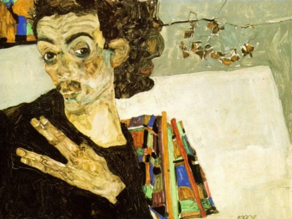
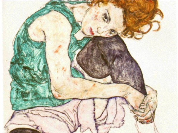
This guy really brings the human figure to a whole new level. I don’t remember much about him from my art history class, so use Wikipedia if you must know. Anyways, he was a protégé of Gustav Klimt, another of my favourites. He was an early expressionist, although his style is being referred to as art noveau a lot. And he got himself in quite a bit of trouble with the morality police thanks to his continuous portrayal of naked women, and on one point got locked up for it, too.
His paintings are awesome, but it’s his drawings that interest me the most, where I can analyze it for myself. I remember a lot of the stuff I did in early art school was all based on my references of Schiele.
I guess that does it for this edition of Jacob tells you what makes him tick. If you want more posts like these, holler back in the comments!
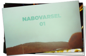 The Nabovarsel Magazine/Zine can now be purchased from my web store.
For any new listeners, you can read all about the magazine in my earlier blog post.
We are still waiting for the physical memory sticks that they will be sold on later, but for now you can just as easily (and at a better price) get the fully digital version if you like. All the text is in Norwegian, but there’s lots of nice pictures too.
Happy days! Feels great to be kinda almost finished-ish!
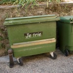 I have to do something better than just playing in the pool when I’m on vacation, so I went and looked for some interesting buildings and signs, which is not hard at all. These are all from Cotignac, a small village right between Nice and Marseilles. The French makes some beautiful signs, but when even the local municipality uses Comic sans (oh, the typography horror), I start to wonder. But since they use it on the garbage bins, maybe it’s really a political message, like “thrash comic sans”?
Just wanted to share this brilliant video, Super sexy CPR. It is of course a promotional video for Fortnight Lingerie, a very small scale Canadian lingerie shop it appears, with an Etsy shop and everything.
This is what American Apparel could have been, if they thought a bit about concept, instead of just pushing woman bits in our faces on general principle.
I’ll try to elaborate a bit:
The woman bits in this video are there for a reason, thus making it okay, in a way. The “woman bits industry”, exemplified by American Apparel, really has no excuse. They just squeeze in nipples everywhere they can because they know it sells more socks. In a way, American apparel could possibly get away with it if they conjured up a better context and syntax for their ads. What on earth that last bit means, I’ll let you sit and think about. Unless you are to busy thinking about all the exposed flesh in the video, in which case you already failed.