Dec 2, 2010
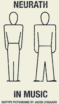
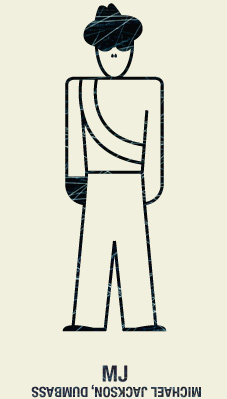
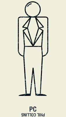
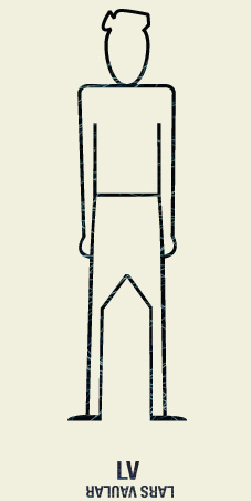
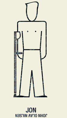
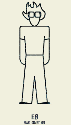
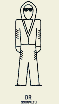
We are currently working a lot with pictograms, so I made this small series based on the local music scene, using Otto Neuraths ISOTYPE standard from the early 1900’s. See if you can name them all, without looking at the names!

Let’s start with the biggest international icon of all, to warm up:

Here’s another international act, slightly harder. Bald guy with a blazer, come on.

All right, enough playing around. Here’s the rundown of the Bergen Hall of fame (images link to their websites):


By the way, did you notice they’re all white boys? Sorry girls, there’s a lot of talented chicks in town, but none of you have any really big noses or small heads or something. Sure, I could put up four girls and a guitar, but that would be every girl band out there. Annie, can’t you start wearing a rubber duck costume at all times? Would make my job easier, thanx.
Nov 29, 2010
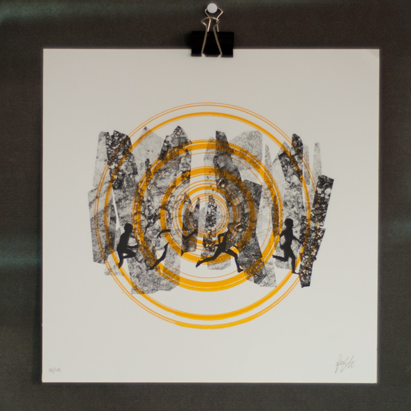
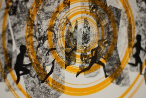
Hooray, I just finished my newest print!
This began as a commission for the Oslo based magazine Kokong, who asked me to make something on the topic of “want” for their next issue. After a long doodling process I asked myself what I wanted to do, which was as you can see, to go out and run in the forest. What can I say, it was november, it was inner city pressure.
After I made the exclusive prints for Kokong, I kept on working with the idea, since I liked the kids running and the stone/trees. So I remixed the motif a bit, working on a slightly abstract sun flare, and made a second edition of 102, available to all of you.
If you like it, give it a “social media thumbs up” and if you really like it, go get one already!


Nov 5, 2010
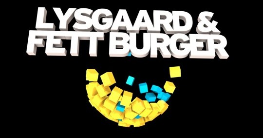
We have been working a lot with Cinema4D at school lately, doing 3D modeling, animation and so on. I decided to hit two birds with one stone and make some visuals for some stage shows that are coming up. I’m playing this saturday together with Dj Fett Burger at Electric Café, and then there’s the DASO event later this month. 
It’s a lot of fun working with these things, but I’ve tried to keep things simple, and focus more on making things pretty, rather than technically advanced. Later I would love to go into making more complicated machines, for example modelling a working maltese cross (used in clocks). Check out the videos below.
Oct 2, 2010
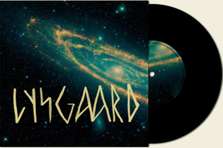
 I recently re-did the whole graphic presence for my electronic music pseudonym, Lysgaard. The concept behind the design was based on the visual language of old viking lore, combined with semi-modern space exploration. Seeing as I’m a hearty Norwegian, travelling the fjords of techno, it’s a fitting image. If you’ve seen the techno viking video that’s already a classic on youtube, you might get a glimpse of some strange inspiration, too.
The biggest exposure areas for this new profile is mainly the Lysgaard website, (made with cargo), and the MySpace page. There are plenty of other branding elements coming in the future, for posters, records and so on, but first thing’s first. I’m in no hurry.

Aug 17, 2010
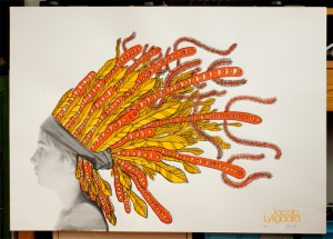
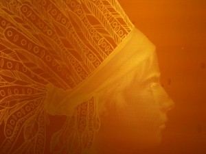
My newest silk screening project, entitled “Indianer” is finished, and now available in the store!

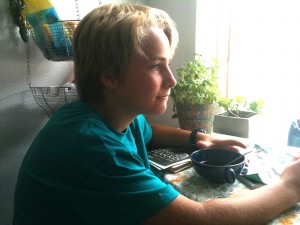
This art print is the next incarnation in my ongoing series on juxtaposing portrait photography and illustration. The last piece in this series, as you might guess, was the one with the viking kosmonaut. The boy is my little brother Mons, who were so kind to spend an afternoon chilling out in the photo studio. Here’s some behind the scenes footage:


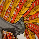
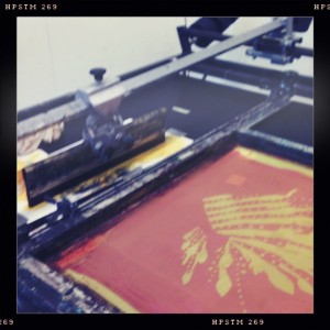
And here’s some quick shots from the process, my silk screening frames for example:


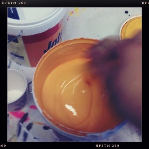
Whipping out some paint:

 The print is available in the store as of right now, and the older prints are going on a big sale, to clean out my stocks. As we say in Norway, Løp og kjøp!

Aug 6, 2010
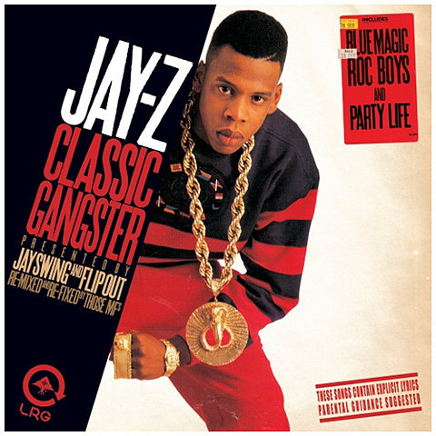
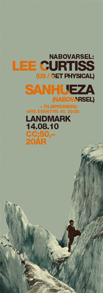
I just finished a new poster for a Nabovarsel event. I started out with the image of the glacier, and decided to be inspired by this Jay-Z cover:

And so this is what came out:

Okay, so the Jay-Z reference might not be too obvious. But it’s what started me thinking. What do you guys think?
