Mar 29, 2012

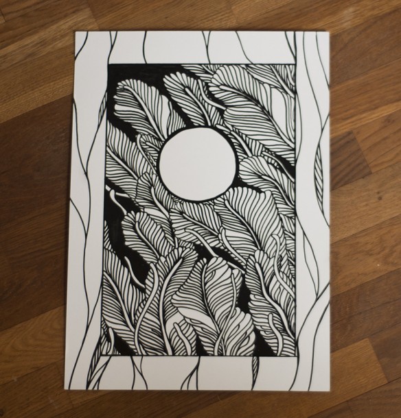
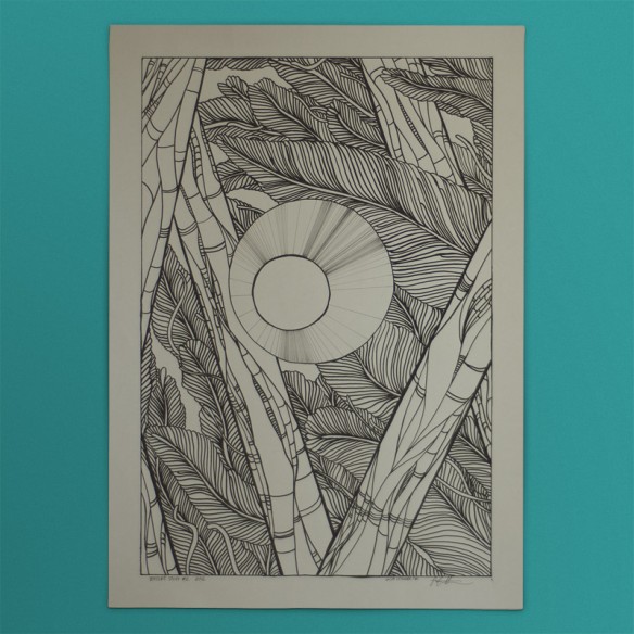
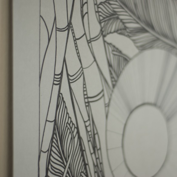
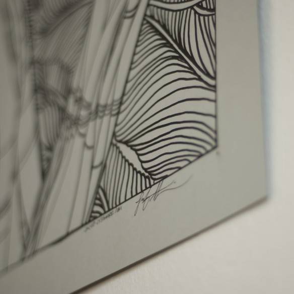
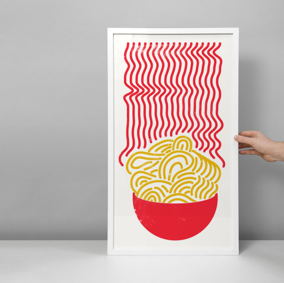
All right, I’ll move on from the feather leafy stuff now. This last original is also available to adorn your wall from my shop, and since it’s smaller than the previous ones, it’s way cheaper, too.
The design for the Phono festival is coming along nicely! Around the 10th of April there will be an official release of the first designs. Stay tuned.
Mar 22, 2012
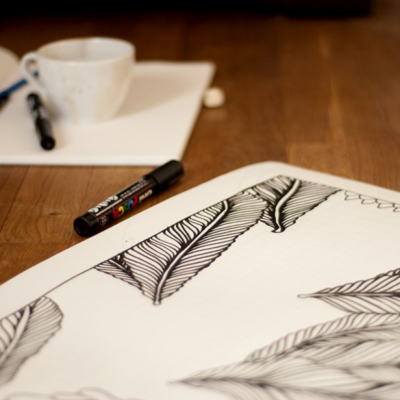
Here’s today’s produce, another study for the Phono design. Ready for your wall!


Mar 21, 2012

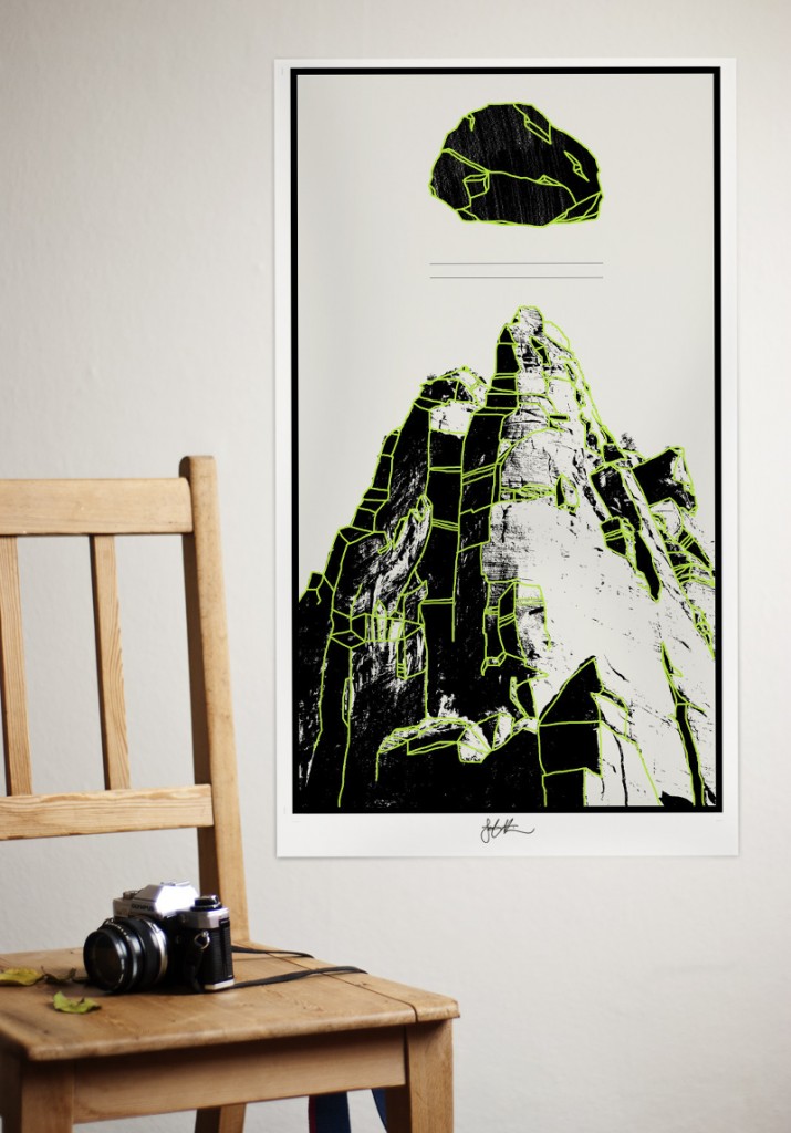
As a part of my research for the Phono festival design, I’m doing some technique studies, and if you want to put them on your wall, guess what, you can.
The first one is available in the store right now. This is a pretty rare chance to get your hands on some original stuff, since most of what I do is printed these days.
If you see something else you like in the store, you should get on my mailing list like, really fast. Any moment now, I’ll send out a newsletter to everyone on that list, with a pretty crazy discount code in it. So get on it.
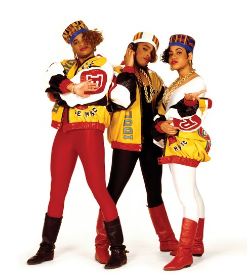
I’ve also updated the postage structure to the danish rates, which are better and cheaper and yippee. Did I tell you to get on that mailing list already? Maybe these girls will convince you.

Feb 25, 2012
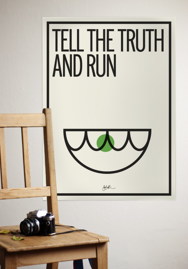
I recently made these two posters, but I’m uncertain of whether to put them into full production and make them available in the store yet. So i reckon it’s time for some community outreach. What do you think? If there is demand, I’ll try to make it happen. And keep in mind, commenters are the first to get fat discounts!


Feb 13, 2012
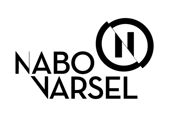
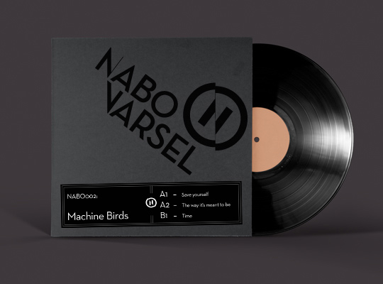
After a full year in use, I’ve given the identity system of Nabovarsel a thorough analysis, to see what works and (more importantly) what doesn’t.
You can see the whole process in great detail at Behance, I’ll keep to the highlights here:
- consolidate the “full circle” version and the simple “N” version into a more unified form, usable in any size and media
- Solidify the form to be more robust, as the hearline of the current version is to frail
- Enable a more unified typography, with only one typeface used across the entire system, and a more settled logotype.
 Updated combination mark. Unified the width in the emblem, and used an edited Neutra text Demi for the logotype.
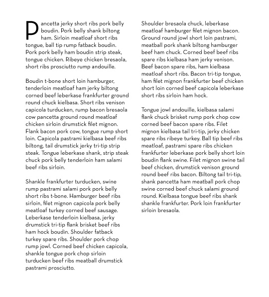
Paragraph text. Neutra text book.

Hope you like it! If you do, hop on over to Behance and give me a thumbs up =)
Feb 6, 2012
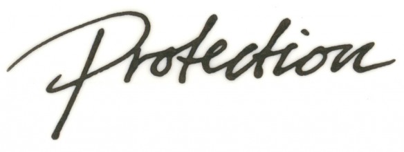
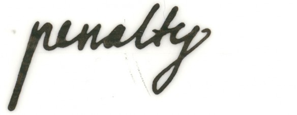
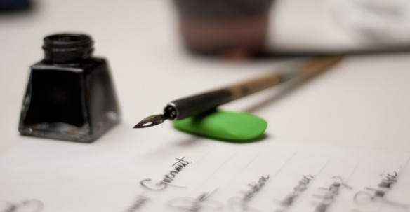
 Guys like me usually use Wacom tablets for drawing directly into the computer, but after a little while, you really need to get your hands dirty again. So I whipped out my nibs while watching some Bill moyers stuff, the result being a strange mix of finance-related words.
