Pax Tantor got featured in Typography served!
Just sharing my glee over the fact that my typeface Pax Tantor got featured in Typography Served, one of the most influential places for typography on the web. Celebrate with cake!
Just sharing my glee over the fact that my typeface Pax Tantor got featured in Typography Served, one of the most influential places for typography on the web. Celebrate with cake!
Hello Beatport. Yes, I’m talking to you, the world’s biggest online retailer of music for DJs. I fixed you.
Cue obnoxious rant.
Images copyrighted by their respective owners. But you all know that.
Finally! I’ve been waiting a while to be able to show you this, the teaser poster for this years Phonofestivalen. Designed by me, yippi-yey!
The starting point for the poster was the same as for the festival; discovery. The festival is all about discovering new bands and musical stuff, so my work becomes all about finding new details and things in there to look at. You should be able to see this thing quite a few times, and still find something new!
A detailed account of the whole design (both the poster, and the festival as a whole) should find its way to behance before long. The festival folks are having their own release party at the website.
In the midst of everything else going on, I’ve put out this print as part of one of my pet projects; The Truth In Hard Places. This is the first print in that series, aptly named Truth #1.
The series is, in very short terms, about finding answers through struggle. Proper knowledge never comes easy. I could go on about how this motif makes sense and yada yada, but I fear it only makes sense to me.
This first print is available as a giclee print through Society6, here. You can even get it as a phone cover or a laptop thingy, if you’re into that jazz.
My other big project, for the phono festival, is going peachy. After two full weeks of drawing non stop and making my hands look like broken twigs, the composition finally makes sense. Can’t wait to show you the whole thing! (It even shares elements with this print, actually). Sneak peeks at facebook!

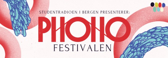
Hooray! The first part of the design work for this years Phono festival in Bergen is done, namely the website and other digital goods. The feedback so far has been just great, so I hope it will still look awesome in a few months time, at the festival itself.
The biggest part of this first launch is probably the logotype revelation. I had a pretty heavy process to arrive at this tape-inspired thing you see up top, and expect to see a lot more of the outlying graphical elements in the upcoming posters.
Go check out their website, which I based on a layout from WPshower, and tweaked to fit. They also have a facebook page that you should click like really hard on.
More parts of the design will be visible as the posters and everything start rolling out.