Over the last few months I have been developing the identity system of DOT; perhaps the most badass music collective in the Norwegian electronic music scene. I adopted a fairly streamlined methodology in this project, so let’s talk about it!
Now that the complete version of the branding system is official, I can share some behind-the-scenes details of the design process and how we have worked. This is going to be a top-to-bottom tell-all to show you how we worked, and hopefully, you can use some of this for your own work.
Most people underestimate the value and potential of involving the client in the creative process, because it’s hard. So let’s talk about just that.
Involving the client in the work you do for them is very often thought of as a necessary evil at best, a complete hellscape of nitpicking and micromanaging at worst, and to be avoided completely if at all possible.
I’ve had clients who’ve deserved this mindset in the past, usually because they have no concept of, or respect for, what it is I do. The clients who always think they know better, they just need you to do the computer thing. I would say such clients are to be avoided, but in reality of course, they cannot be. Bridging this gap is all about teaching the client to understand the value your expertise brings, and being humble yourself — remember that the client usually knows their business better than you do, just like you know yours, and their insight is not to be thrown away lightly.
I sometimes say I don’t charge for what I can do, I charge for what I know. There is a small difference of words there, making a huge difference in meaning. What I do is the muscle, what I know is the wisdom.
Thankfully, the people behind DOT are not only friends; they have a very well-trained eye for the minutia of style, and they know the value I bring. But regardless of how high on the table your feet are in the meetings, we need good systems to get to a good place. So let’s go through it point by point:
1: Commission a mission statement from the client leadership
A lot of the time the client doesn’t have their elevator pitch down and have a hard time really putting into words what they are all about.
For brand new businesses this is normal, sometimes even more so for someone who’s been in it for three generations. “We just do what we’ve always done”. Corporate visions and words like purpose often gets booed for being just ways to spend money on advisors, but thankfully, when the bottom line goes up, objections go down. Communicating what they are about is why you are here. You need to ask the client what that is, exactly. This is essential, as any concept you come up with will be foundationless and will rot from day one without it.
Expect to spend time helping a client through this process, your job is to connect conceptual dots and make the intangible visible, not knowing where the buttons are in Photoshop. And if the client thinks having a mission statement is dumb or they “don’t have time for this”, then either they are right, it’s a barbershop, just do a barbershop logo! Or it’s a major red flag that they don’t recognise the power of the service you provide, and would probably be happy with a smile emoji as their logo. Either educate or run away, your call. Thankfully with DOT, this was not a problem as they all know the power of a smashing concept and wrote a manifest precisely nailing what they are all about.
Hot tip: I put the DOT manifesto up top in their case study, being quite confident in my ability to translate it. Take a look!
2: Set up a communal gathering point for inspiration and input
This happens at the same time as the prior point. To start things off, it’s important to make a space where every stakeholder can voice their opinions, and show their thoughts and input. This needs to happen right at the beginning, and include as many people as possible. If this point is neglected (and it often is) it can and will bite you later down the line, in the form of nitpicking, design-by-committee, and justifiable critique when it’s too late to turn back.
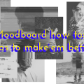
This can take the form of a Slack channel/chat room, an email chain or in this case, a shared and secret Pinterest board.
It is paramount to give every stakeholder a voice, in order to anchor every decision being made and give them ownership of both the process and the finished product. When the shared space is made in this way from the start, everyone feels heard even if you elect to ignore some of the ideas there. And you will, because there’s gonna be a lot of bad ideas, and most of them will probably be yours. But that’s kind of the point, to cast a wide net and have a low bar of entry in the beginning. Thank you for adding all the cat pictures to the vision board Karen, we have taken them into consideration (meaning we have elected to ignore them). this gets rid of the obvious and short-sighted ideas that usually float up quickly in the beginning of the process. Example: making the logo a literal representation of the clients business/product, or what we call “horse-horse”-thinking, the bread and butter of terrible designers everywhere.
It’s usually a good idea to have a hard no-deletion policy in the beginning no encourage free thinking, do not delete anything until after point three, when you can back up your decisions. Remember: Right now your only authority is self-righteousness, so keep an open mind.
And whatever you do, don’t get caught up in visual ideas at this point, except the very broad strokes of style. How it looks will come later.
3: Write a design brief together
Based on the mission statement, we wrote a design brief that takes the vision defined by the client, and converts it into deliverables, concept starting points and goals. Example: It should communicate our commitment to the culture, and show our heritage in the clubbing sphere.
The brief can include examples of design directions but don’t commit to too much. It’s important to hit the appropriate amount of “locking down” the goals: Too restrictive, and the goals will be impossible to all be met. The project will die of creative constipation. Too loose, and this whole ordeal is rendered useless, as anything is now apparently possible. Creativity flourishes within restrictions, there is nothing more daunting than an empty canvas.
—And if you already have the logo in your head at this point, kick yourself. You’re just dragging out the process, making it more expensive for the client, and making a lesser product. Make an example of yourself and throw that idea out on principle. Tough shit.
Circulate the brief amongst the client, at least at the leadership level. This will anchor your decisions with them later on, and make you responsible for actually following the goals you have set out (scary, I know). Remember, These are the deliverables. And keep the brief very, very close throughout the process. It’s very easy to forget it in some drawer or folder, but every decision you make has to be anchored in this document. So print it out and hang it on your wall and leave it under your pillow. Write “I am the captain now” on the cover.
Once this has been written, it might be a good idea to have a look back at the inspiration depository you made in point one, and see what directions can be thrown out right away. Some directions might stick out as right on the money, some are obvious throw-outs. Follow the evidence.
4: This part you know
All right, now the part you learned in school begins. Brew up a big pot of ƉЄϨỊ₲И, but wait as long as you can before you make things directly visual. It’s generally a good idea to keep your work written, not drawn, for as long as possible. But this is a whole other article.
At the end of this process, you should have a working prototype.

5: Test your prototype
Throw every bad use case, edge case, and nut case you have at what you just made, and look at your work as it comes apart at the seams. This is where you realise that your stroke width looks shitty in small sizes, that the wordmark is unbalanced when combined with copy, and a thousand little other things.
Sometimes a project involves a new website alongside the visual identity for example, and you get to work on both at the same time. As much as the website needs to be a consequence of the identity, not the other way around, it can be a great opportunity to stress-test the profile, and see what problems arise earlier in the process than would otherwise be possible.
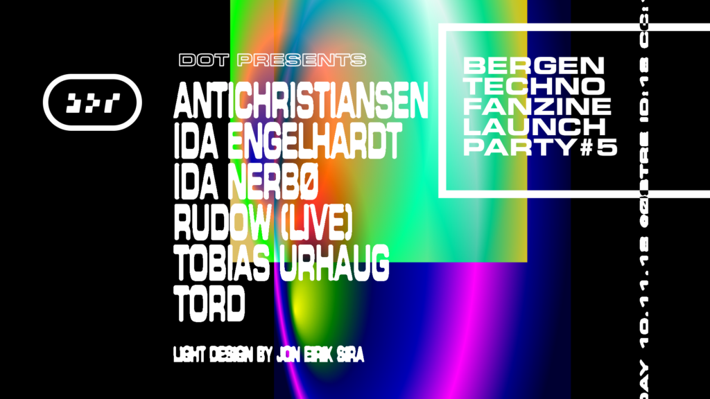
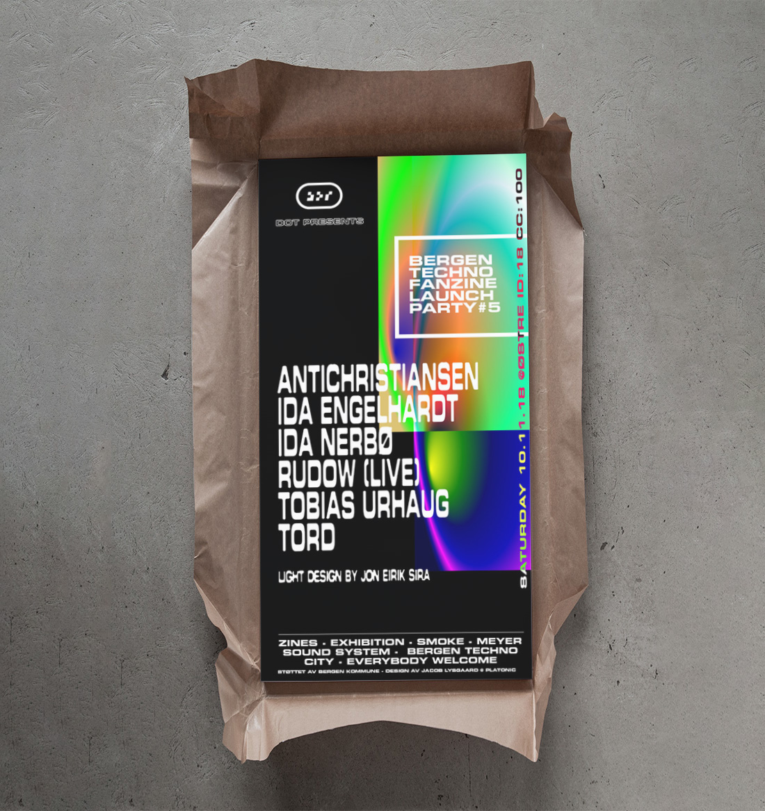
It’s important to keep in mind the unique cases of the brand, and DOT is a good example of that. This identity will be used on a lot of printed matter, but working with small runs and restrictive printing budgets mean that things like colour consistency will be shady at best. So specific Pantone colours are a no-go, and preferably the brand colour should be easily available on Risograph machines for example.
The #1 point of contact for many people with the brand will be as a stamp on their wrist when they enter a club or event. That means smudging will be an issue, so no too small details. But it will also show up on huge banners and flags, being hung across dance floors and DJ booths. So it has to bring the bacon in huge sizes, too.
Every project has unique challenges, that’s what makes this job interesting.
7: Document everything
This point deserves its own article, but suffice to say, keep records of every iteration of your work and everything that is being said and done. For legal reasons sure, but more importantly to keep track of your creative process. Methodic design processes are evidence-based, and should be organised like a police investigation.
6: Roll it out together with the client
The absolute worst example of a design process I can think of is to disappear for two months, then suddenly show up with a finished product like “Tadaa”. But if the previous points have been more or less been maintained, you should now have a client that gets it. A client that can see the value your work brings, and feels like they have ownership and pride over the finished product.
And that’s kind of it! Well, not even close, but if you’ve been reading this far, thank you and congratulations to your attention span. In future articles we’ll go into the nitty gritty on each of these steps, but for now, go out there and make something cool. Or not cool, if that’s what is needed.
Alt godt,
Jacob
