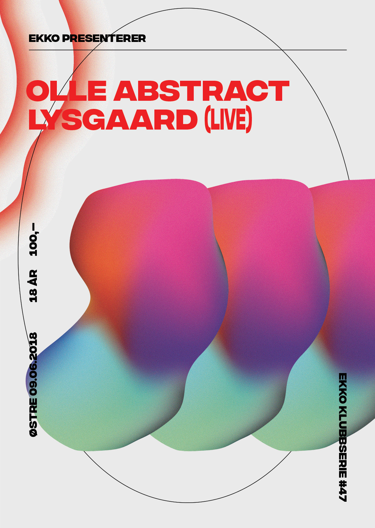
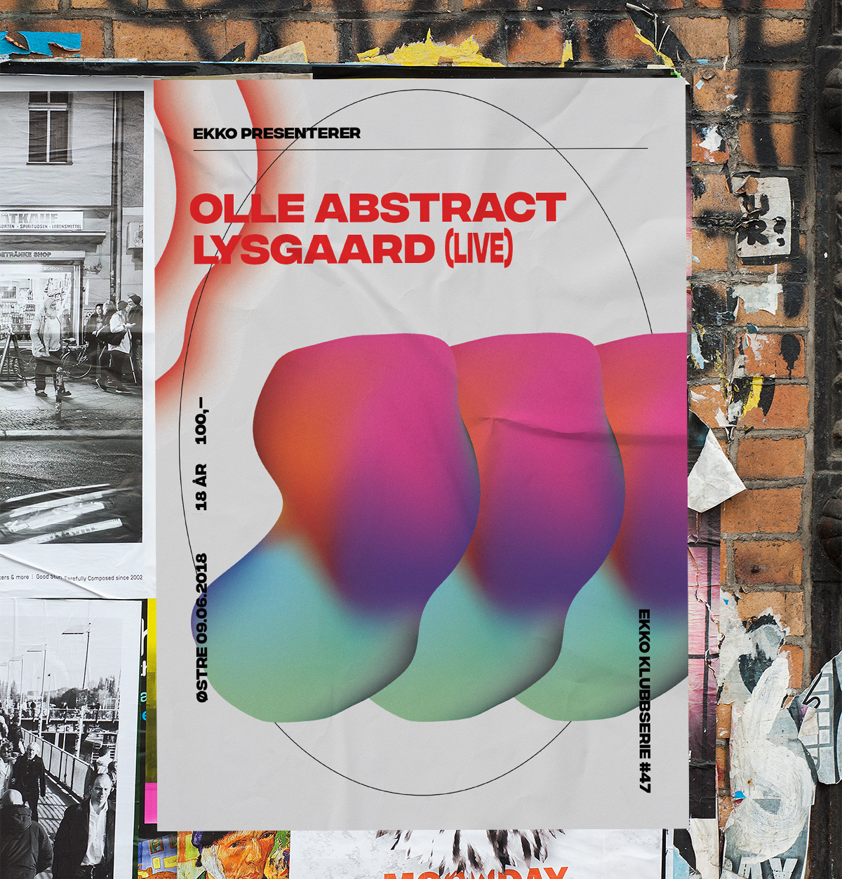
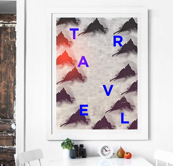
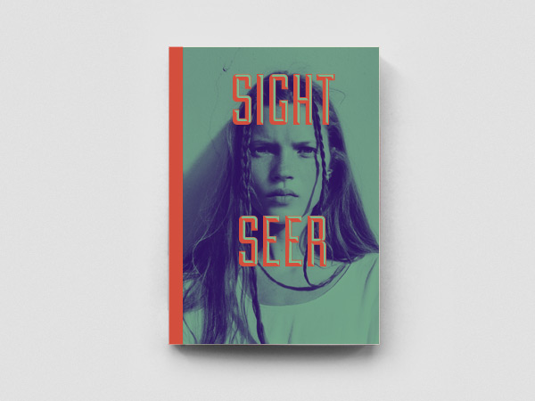
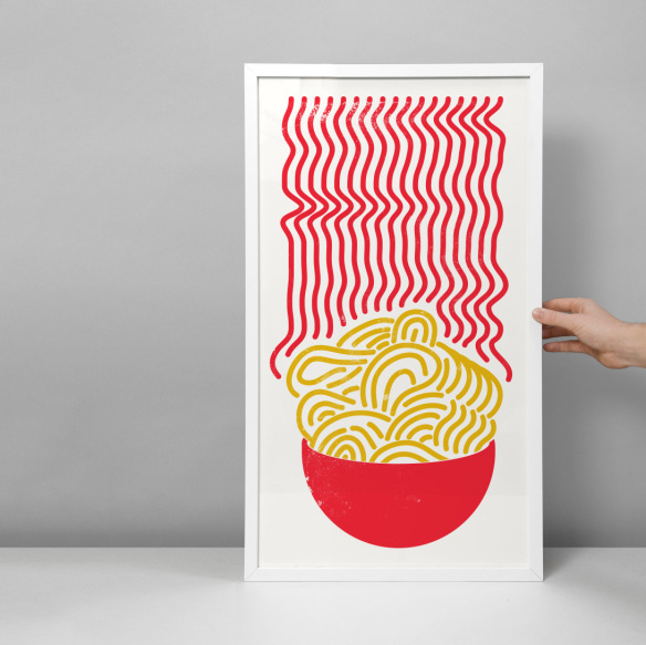
Just finished these posters for a certain someone sharing my last name. It’s gonna be a blast! And it was a lot of fun to take some old illustration techniques into a new direction for this, making some meshes that looks like… knees? And it’s always interesting to take the static design into animation (for social media), even if it’s very basic stuff. It tends to squeeze an extra portion of something out of you every time. Sorry, that might sound a little gross. It’s fun, is what I’m saying.
If you want to dig into my technique; these are mostly made using gradient meshes in Illustrator, first and foremost. I’ve always been a sucker for colorful gradients, but these tricks can take those vibes into a wholly new dimension. Hope you like them too!
