Here’s a thought.
Art is supposed to be, by some definitions, incomprehensible. Shattering, obscure, never-ending.
Design, on the other hand, is structure and organisation of content, getting the message across, explanations and obviousness. in short, the opposite. How can you make something which is both?
Both art and design takes many forms, and a lot of the time the two terms does not intermingle at all (that I can think of). Take interface design and abstract sculpture, for example. Let me see you mix those two up. Okay, so we both just did, in our heads. But you know what I mean.
Let us then think of something more familiar, like an event poster. In this realm, art and design acts more like two opposite points on an axis, two different colors of clay that can be mixed.
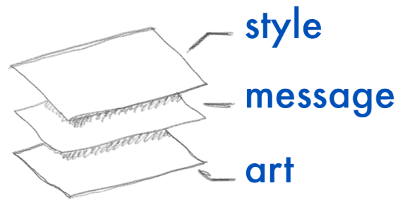
Let’s look at what happens when an observer views a piece, in the order they see the content:
So in order of what the observer sees (or, if you will, comprehends), it goes like this: First is the style, that is, the cultural references, the eye-catcher, is it “my kind of cool”, does it feel like it belongs to me. Then comes the information, the practical necessities and the core of the message you are trying to get across. Some times the “core” message is embedded in the other layers, and this is the most mis-used layers, as many people think it is the only one. Lastly, but in a multitude, lies the art. This can be one layer, or many, or none. The longer the piece is viewed, and the more the viewer comprehends, the deeper one sees. But since the deeper layers are covered by the ones above, it quickly gets murky and dark, leaving viewers confused and interpretations flailing.
This may seem strictly academic, and this may simply be the coffee talking, but keeping this order, as well as how to mediate the contradictions in mind, can do great things for how you work. The most important part is knowing that these “layers” exist, and identifying them in your own work.
If one or more layers are missing, you have a problem no matter what you are making. What do you think?


Veldig interessant! Dette forenklet en ofte veldig abstrakt og komplisert tankeprosess man gjerne har når man designer. Svært nyttig innlegg.
What is and what ain’t? A cover is a cover only if there is something underneath. That makes two layers. But if you want to be invisible by a cover (‘undercover’) you better not use glass. Or if you do, you must paint it. Drager Meurtant is working in art with such layers (see website). And do not forget ‘focus’ (or diaphragm): if focus is deep, the surface is blurred.