Hello Beatport. Yes, I’m talking to you, the world’s biggest online retailer of music for DJs. I fixed you.
Cue obnoxious rant.
Now, your design team has overall done a great job with the site. Really. But there are some clear things missing. Some things get rushed, we get it. But seriously. We have to look at this stuff every day.
Here’s what’s broken. The biggest things, anyways. I’ll get into detail, I promise.
- A lot of your buttons looks like labels, and some labels looks like buttons. This is day one of UX school, folks.
- Your track navigation buttons look like shit. We mean it.
- That ugly-ass grey background with the headset looking like a vector tutorial from the bad part of the nineties. Get out.
If you want to start being awesome, you could commission known cover artists to make some rad backgrounds for the site. It’s outside the content, so it couldn’t mess up anything. - The artist pages, I mean what the hell.
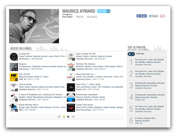
So this is what your artist pages looks like right now. Ugh. The artist photo is puny, there’s lots of white space with no purpose (we call that a hole), those social buttons are falling off the walls and the top ten list gets pushed down so much, it only shows about half above the fold. Which also means, it creates some weird whitespace below the “latest releases”.
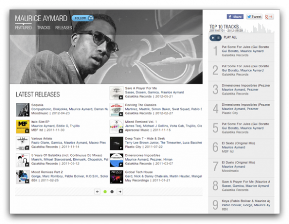
Also, the “featured/tracks/releases” navigation up top is inconsistent with the tracks and releases pages, so when you click in the menu, it vanishes. Come on.
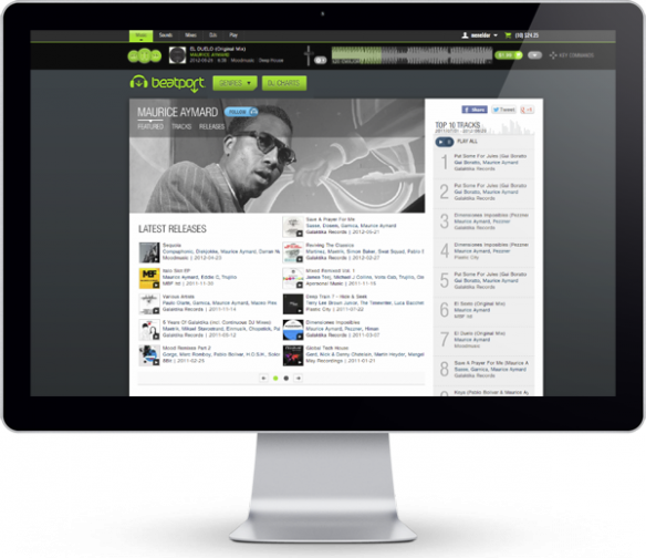
There, I fixed it. The golden rule is in the house. Please tell me this doesn’t make you want to buy some music. The new “follow”-button you can get for free.
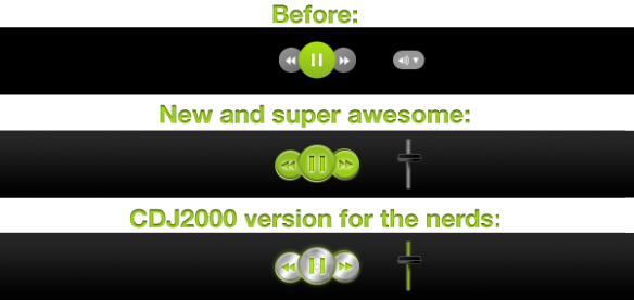
And I made you some new play buttons, as well as a volume control. Personally, I’m not a fan of skeumorphism, but buttons should look like buttons still. Plus, we have the rich visual language of turntables and audio gear to play from. We can’t miss out on that.
Your buttons, or whatever you want to call that, are up top. Mine are below. Mine look like they should be clicked.
This took me about three hours of work. It’s not rocket science. Imagine what I could do with a week. If you actually agree with me, let’s talk business. I’m not this big a douche in real life.
And to everybody else watching, thank you. Holla back in the comments if you have an opinion.
PS. This is being cross-posted to my behance portfolio, just so you know.
