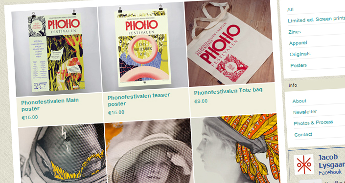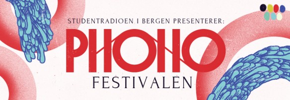
Hooray! The first part of the design work for this years Phono festival in Bergen is done, namely the website and other digital goods. The feedback so far has been just great, so I hope it will still look awesome in a few months time, at the festival itself.
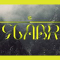
The biggest part of this first launch is probably the logotype revelation. I had a pretty heavy process to arrive at this tape-inspired thing you see up top, and expect to see a lot more of the outlying graphical elements in the upcoming posters.
Go check out their website, which I based on a layout from WPshower, and tweaked to fit. They also have a facebook page that you should click like really hard on.
More parts of the design will be visible as the posters and everything start rolling out.
