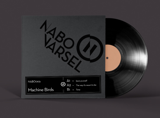
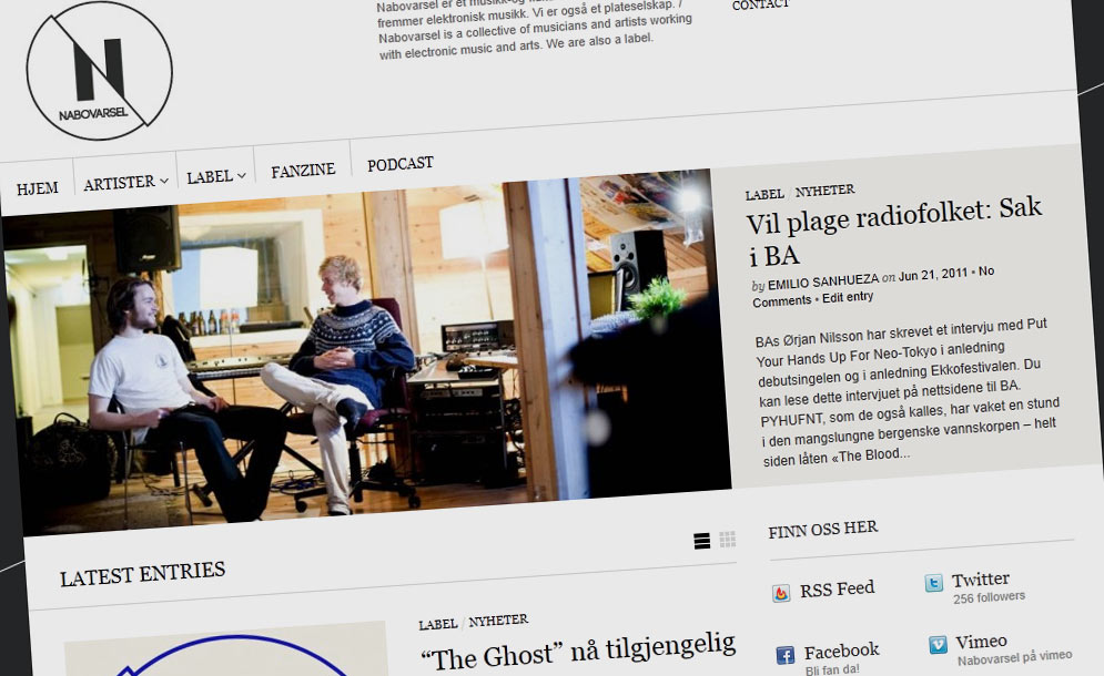
After a full year in use, I’ve given the identity system of Nabovarsel a thorough analysis, to see what works and (more importantly) what doesn’t.
You can see the whole process in great detail at Behance, I’ll keep to the highlights here:
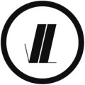
- consolidate the “full circle” version and the simple “N” version into a more unified form, usable in any size and media
- Solidify the form to be more robust, as the hearline of the current version is to frail
- Enable a more unified typography, with only one typeface used across the entire system, and a more settled logotype.
 Updated combination mark. Unified the width in the emblem, and used an edited Neutra text Demi for the logotype.
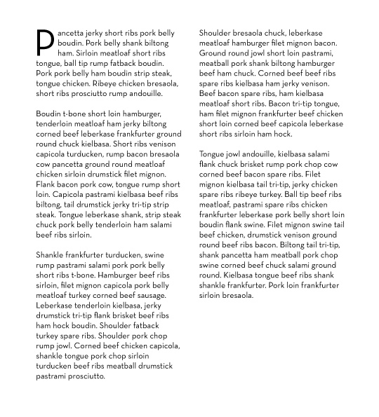
Paragraph text. Neutra text book.
Hope you like it! If you do, hop on over to Behance and give me a thumbs up =)
