I have a new mixtape for my brand new project The set up coming along, and right now I’m working on the cover art. The problem is, I can’t choose which direction I wanna go with it! Take a look at these two versions I have so far.
The one with the lady on it is all cool and kitchy, but looks a lot like something I could have made three years ago(not good). The circle one is more conceptual, but at the same time more… me. . So i need to pick one.
Take note, this is the first mixtape of two, so the next one (titled “the boys”), will have to be made in the same style.
Anybody want to be my divine intervention, giving me some input here? I’m stuck! By the way, click the yellow guy to hear a preview of the tape.
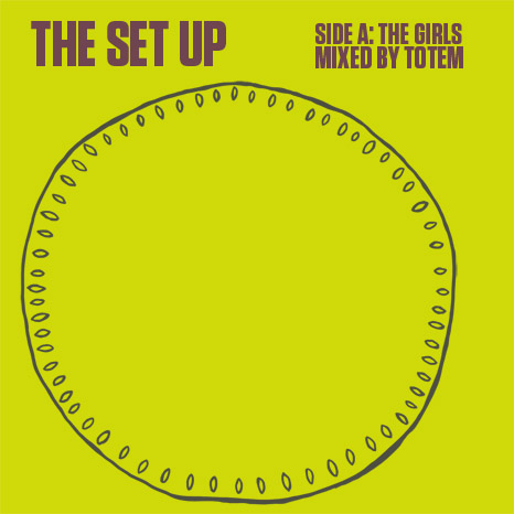
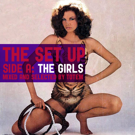
This mixtape will be a cheeze factory like nothing else, and I love it. Hey, it’s for the girls. The boys will get theirs on the next tape, trust me. It’s gonna be 80’s funk-hiphop-early-electro-galore.
Update
i finally got my head from out my ass and settled on this. In a way, it brings the two ideas together conceptually.

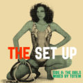

syns den nederste er mad fetest ass!
like WOW!