Hooray! The brand new version of my site is now up and running!
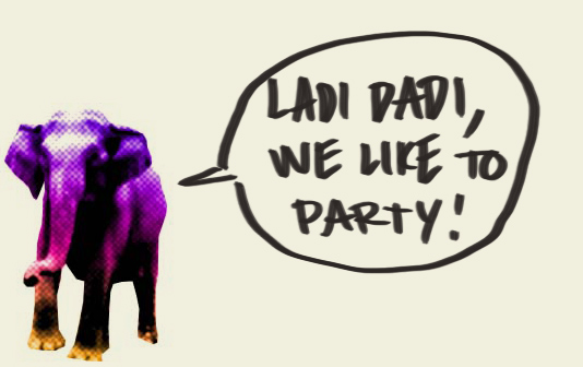
I spent a lot of the summer building this thing. It might not like look a spaceship on top, but trust me, under the hood this thing is an intergalactic juggernaut. The whole header section is designed as a blank canvas, that funky elephant (made for an event in 2008) is just the starting point. More after the jump!
Why change?
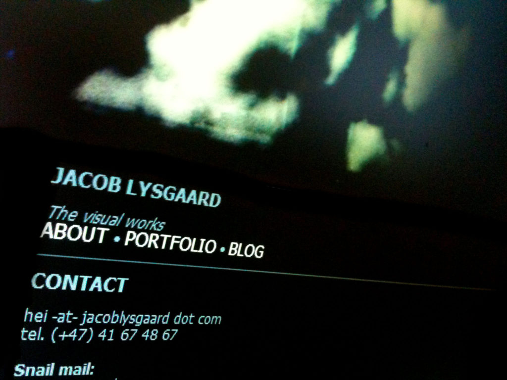
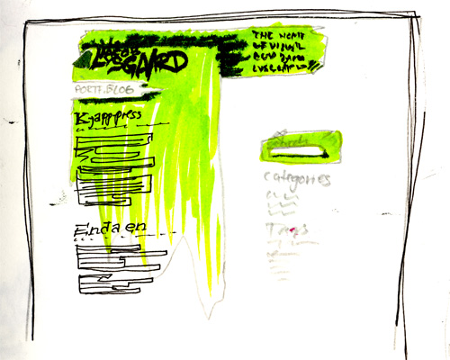
The old site just felt awful; most of the site was plain HTML with a wordpress blog on the side, with the same CSS plastered on top. The layout was confusing, and you could hardly read the damn thing.
When it was initially made though, it worked fine. Big ups to Natasha for helping me with that one, back then I had no skills in building the web, and so Natasha built the first version, as just a single page with my contact info on it. But as i started learning the ropes of web design, and i added two pages and a friggin blog, change was surely needed. Dark grey text on black works fine if you have one sentence and a couple bullet points, but more? No way. Enough about the old, what’s so cool with the new?
Invisible bells & whistles
In the flesh this site looks a whole lot better now, simple as it may be. Take this as a hint that i am no programmer, my talents lie other places. The site will undergo gradual changes continually, some day I’ll get an iPhone app that changes the color background of the whole site based on my mood.. or perhaps I’ll just settle for a new header every now and then.
Now for some techno babble (normal people look away):
As you might already have noticed, the whole site runs on WordPress, with the theme framework Thematic at its base. I have developed my own child theme, aptly named Thessia for its naming resemblance and obscure game reference. Thessia does away with most of Thematic‘s default obviousness, you gotta break down to build up, yo.
If you are looking to make your own blog, but have little experience with code, child themes are the way to go. Basically you overwrite the framework CSS with your own. That way, when some new security flaw is found, and the framework updates with some new fancy features, your child theme stays untouched.
If you want the really easy way out and use Thessia, that would be super cool. Just change the graphics and colors to suit yourself, I made this with flexibility as the chief goal. My code is so clean and well commented it’s like eating at a german lavatory, with the chef standing behind you. So if you wanna change just a little thing, you’ll find it right away.
As of writing this, the child theme is not yet ready for your downloading pleasure, but it will soon, so hang in there.
The summer was long, and I’ve made tons of new things i want to show you. Some DIY instruments, posters, and some truly exiting stuff i don’t want to spill my beans about too soon. So just stop by any time!


New looks look cool!
Tusen takk! Satser på en del flere forbedringer, men grunnlaget er nå støtt som ulriken.