DOT
1.0
introduction
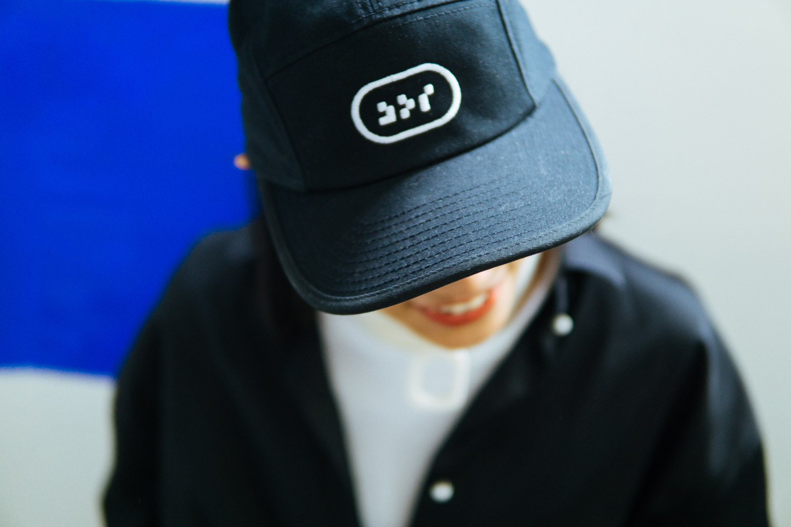
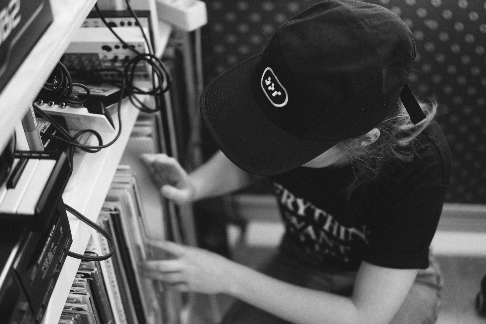
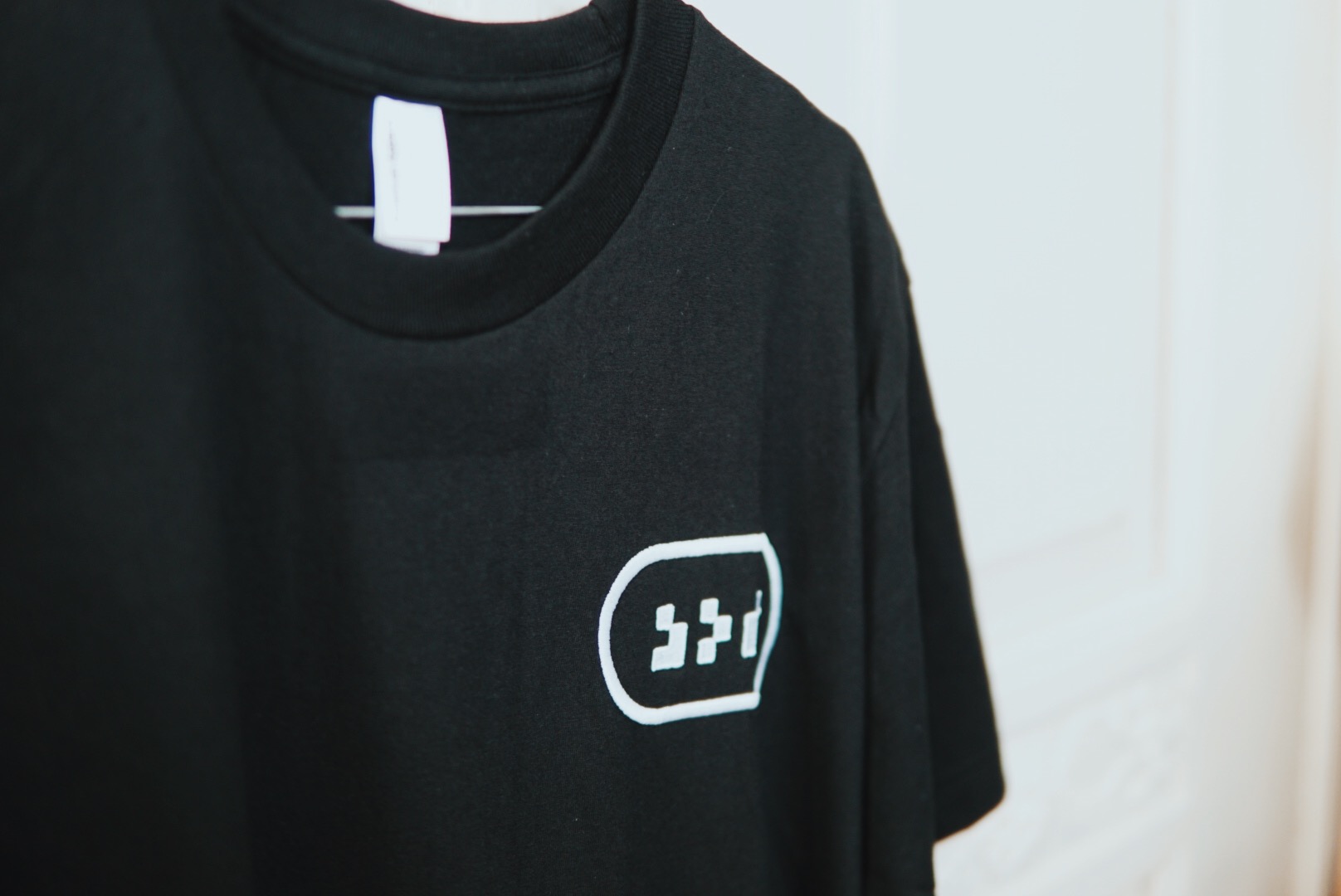
The DOT profile has been one of our passion projects, as we saw a huge potential in their work. Here lies an opportunity for an authentic, geeky and hugely popular brand we believe — and working on this has been an absolute pleasure from the first conversations to when the merchandise is worn at every festival. DOT is an event organisation, deeply embedded in the culture of the Norwegian Electronic music and clubbing scene. In record time they have built up an audience and a reputation on the scale of European majors, but have lacked a unified design system and a visual cohesion to go with it. After some preliminary talks, we decided to commission them in constructing a mission statement — a short document detailing their goals and intent:

MISSION-STATEMENT.txt

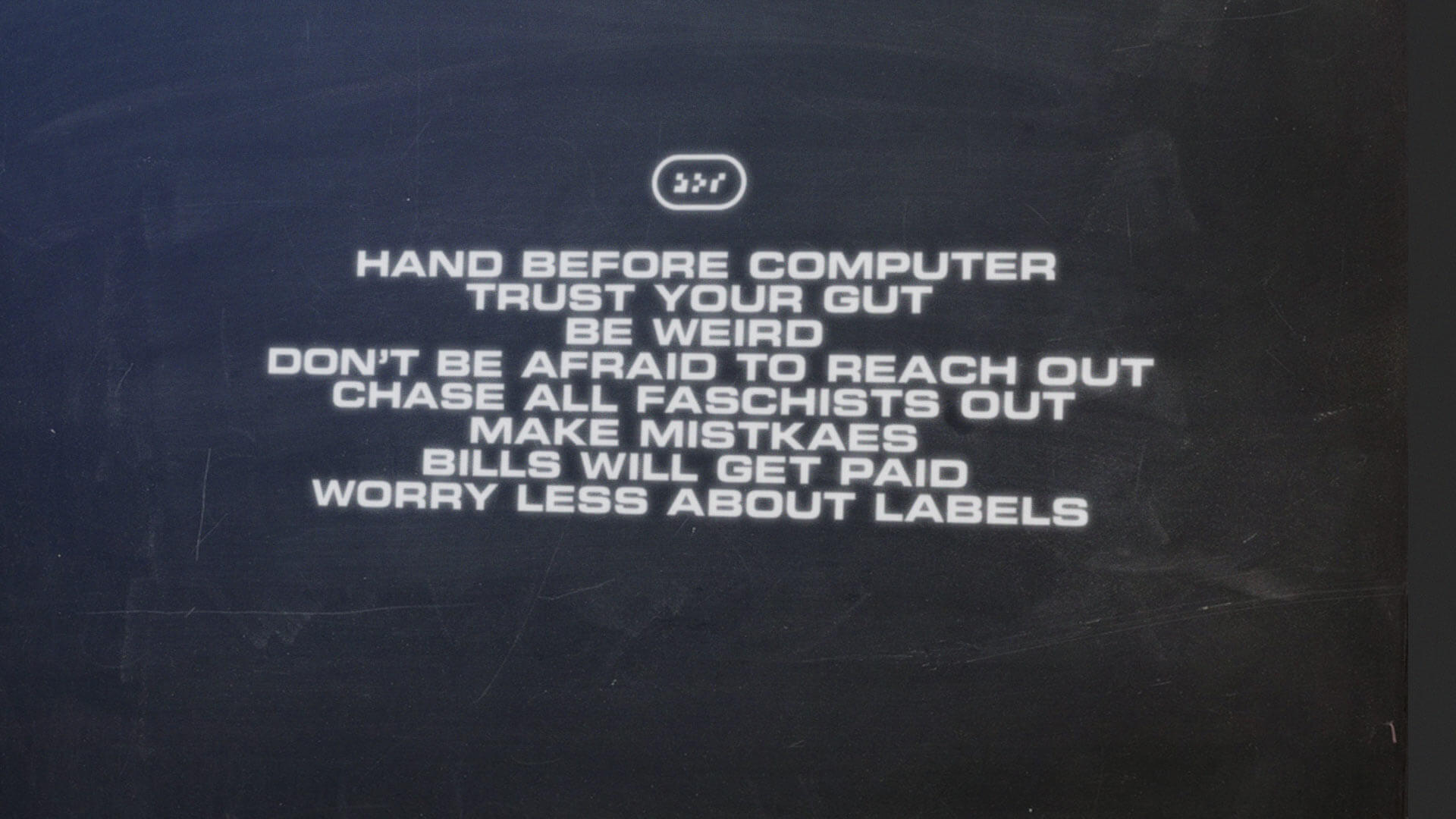
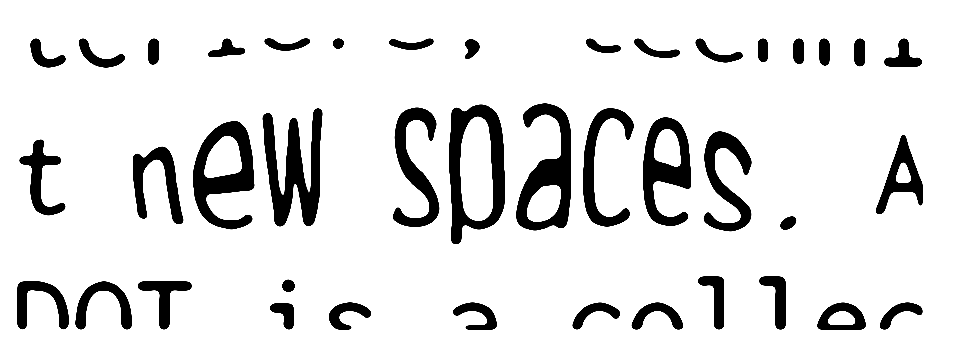
We believe people want unique experiences, discoveries and adventures. Both pleasant and provocative. We believe in being challenged. That’s why at DOT we work towards a mix of music, dance, visual art, physical art and inventions. We want to combine all of it, putting the full experience to the test. The DOT family is about experimenting with interiors, techniques and narratives. DOT is about new spaces. And we hope to meet you there. DOT is a collective of artists, DJs and organizers. We make techno events in its broadest sense.

Phase 1: initiate
We now have a clarity of intent. Using the parts of the statement that I outlined, let’s start a process in four parts:

1.1: “DOT is about new spaces”

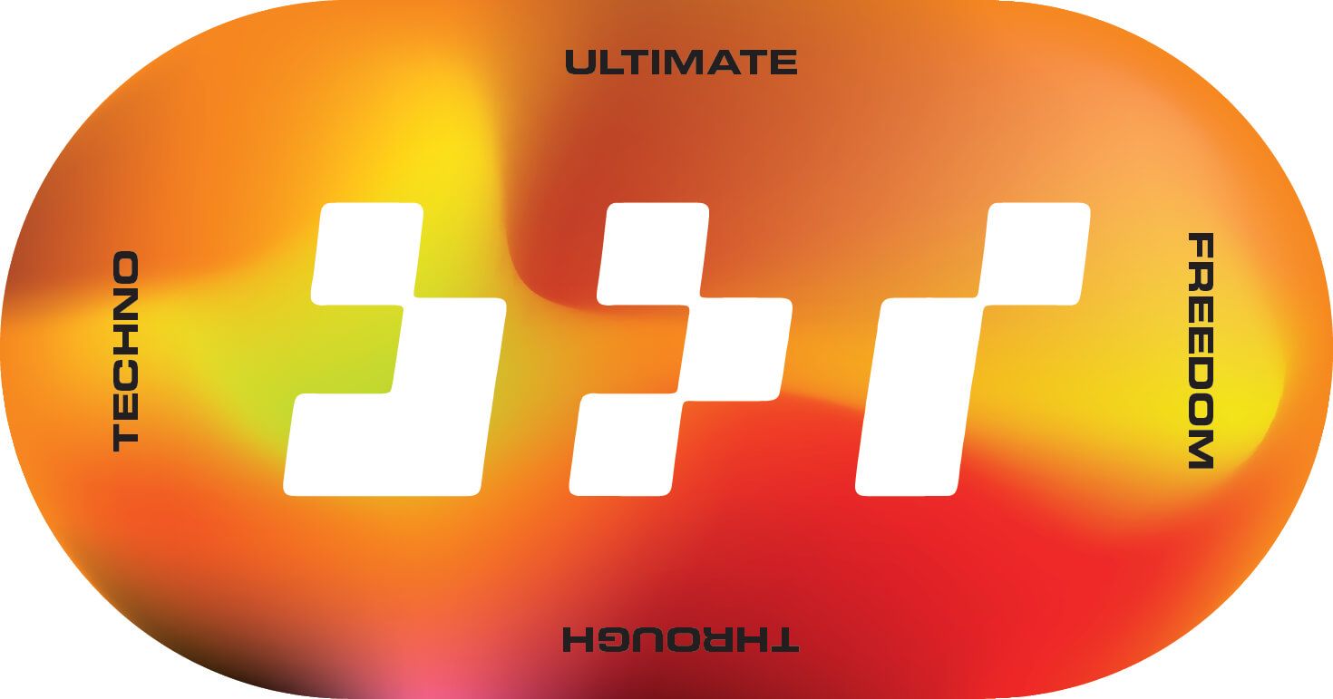
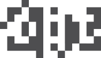
Starting with a cube, representing space, we express the wordmark on a simple pixel grid, reminiscent of early computing.
1.2: “Provocative”

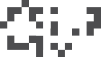
Compressed and simplified, the wordmark becomes increasingly distinct and illegible. It should be a little hard to decipher, but once you get it, you’ll remember it.
1.3: “Experimenting”

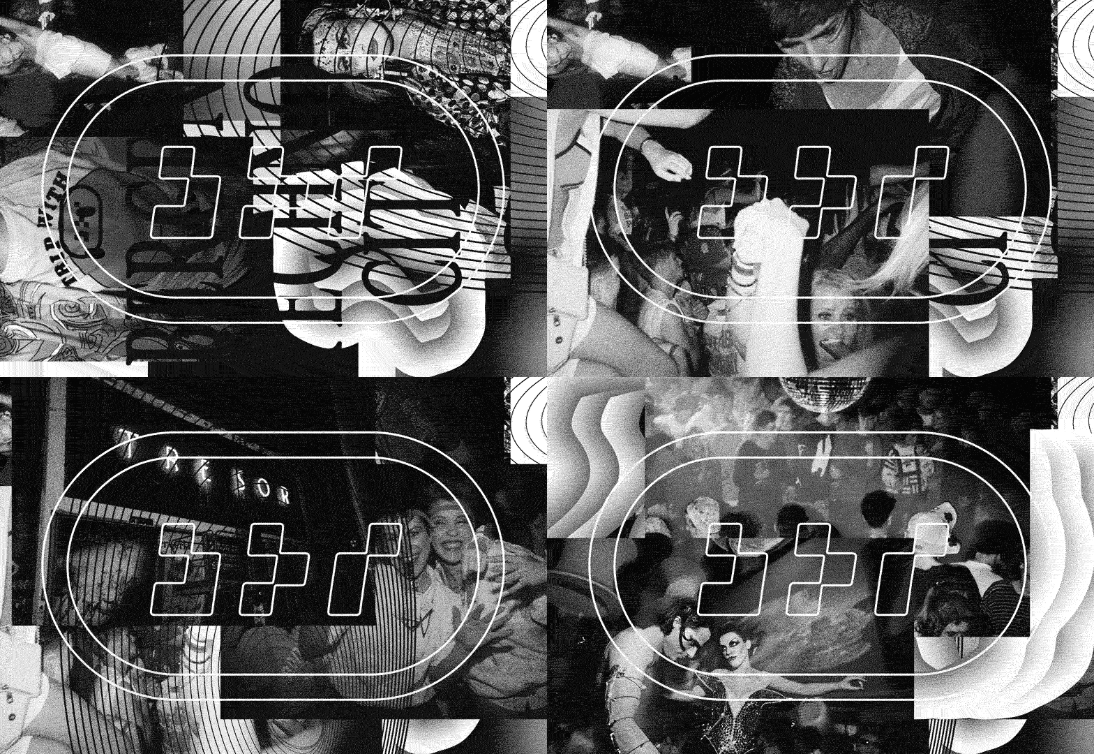
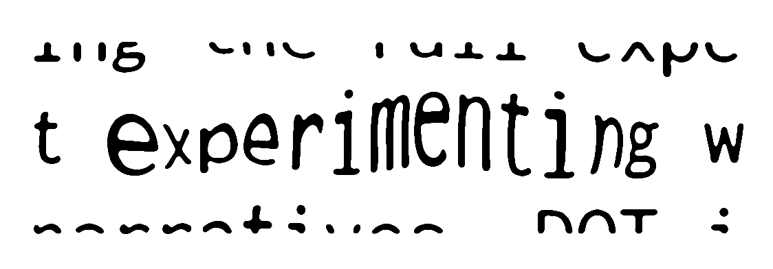
The wordmark is run through a series of processes involving printing and re-digitization, releasing it from the grid

1.4: “Family”

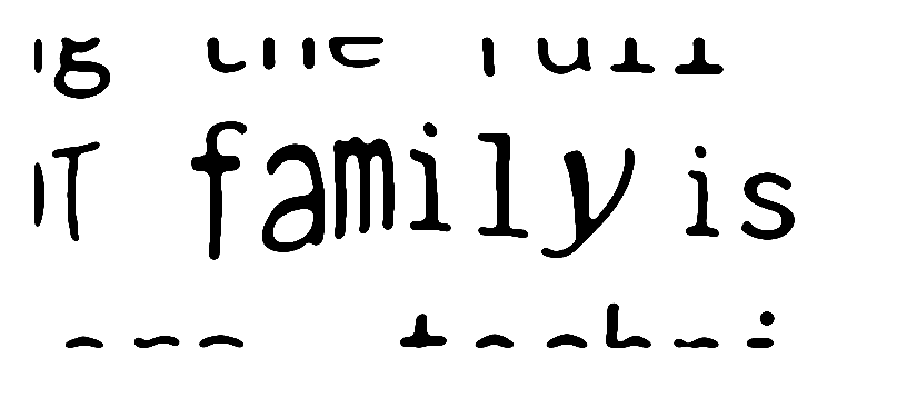
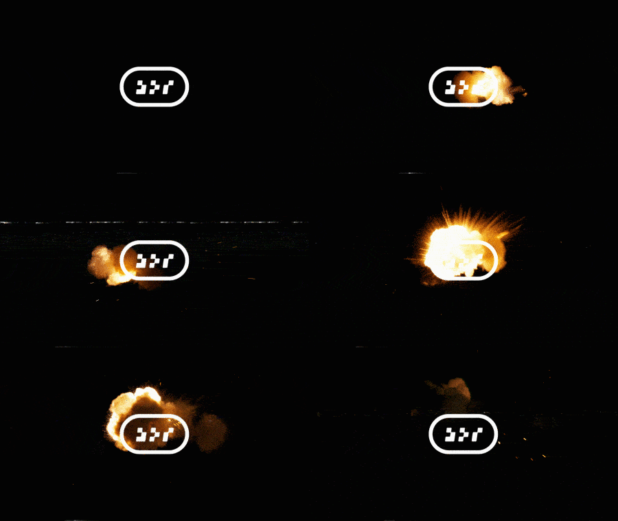
DOT is about being a safer space, where no-one should need to look over their shoulder. We incorporated a holding shape from Japanese heraldry to indicate a family crest, where everyone is welcome.

typography
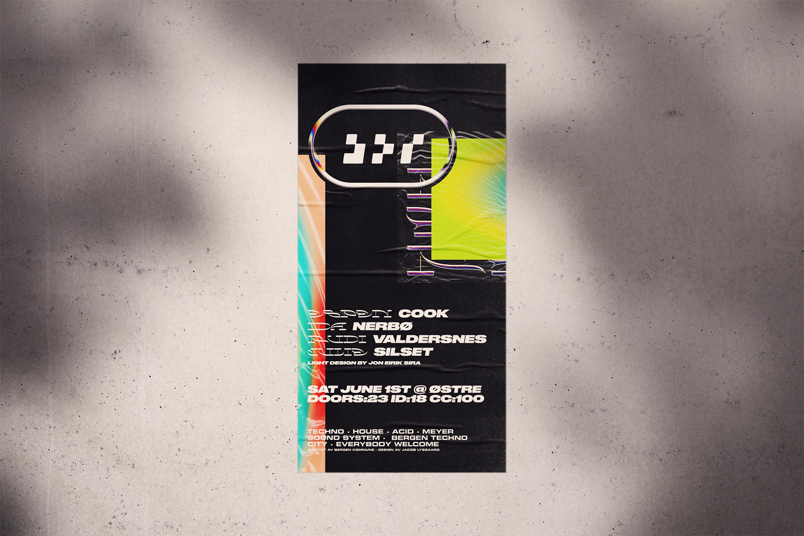
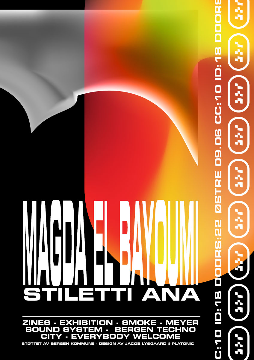
Eurostile Bold Extended in all caps worked wonders when we «beta-tested» it at an event. Bombastic yet humanist, with references to early rave parties and subversive culture. It was the official typeface for the Norwegian police for a long time after all, not to mention a plethora of science fiction films.
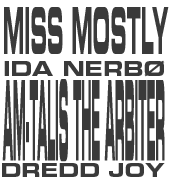
ida nerbø am-talis the arbiter josh wink miss mostly
To subvert the only limitation of Eurostile (its massive width), we elect to break the first rule of typography school — DO NOT STRECH THE FONTS. This allows us massive freedom in choosing emphasis in layouts, such as line-ups on posters.
Colors
With implementations and printing methods spanning from computer screens to Riso machines, setting too many rules would be hard to follow. We therefore have quite lax rules about colours to begin with: Keep them limited, make good choices. Since we will be working closely with DOT going forward, we have time to experiment. In time we will no doubt see some hues that stick out and become our signature.
Thanks for watching. Be sure to let me know if you have questions, need a hand or would like to discuss a project! You can reach me at +47 41674867 or via hei@jacoblysgaard.com